REBUILDING THE HOME FOR
REBUILDING THE HOME FOR THOUSANDS OF PARKOUR ATHLETES
REBUILDING THE HOME FOR
REBUILDING THE HOME FOR
REBUILDING
THE HOME FOR THOUSANDS OF PARKOUR ATHLETES
REBUILDING THE HOME FOR
REBUILDING
THE HOME FOR THOUSANDS OF PARKOUR ATHLETES
REBUILDING THE HOME FOR
THOUSANDS OF PARKOUR ATHLETES
THOUSANDS OF PARKOUR ATHLETES
THOUSANDS OF PARKOUR ATHLETES
THOUSANDS OF PARKOUR ATHLETES
THOUSANDS OF PARKOUR ATHLETES


PROJECT OVERVIEW
PROJECT OVERVIEW
PROJECT OVERVIEW
PROJECT OVERVIEW
PROJECT OVERVIEW
PROJECT OVERVIEW
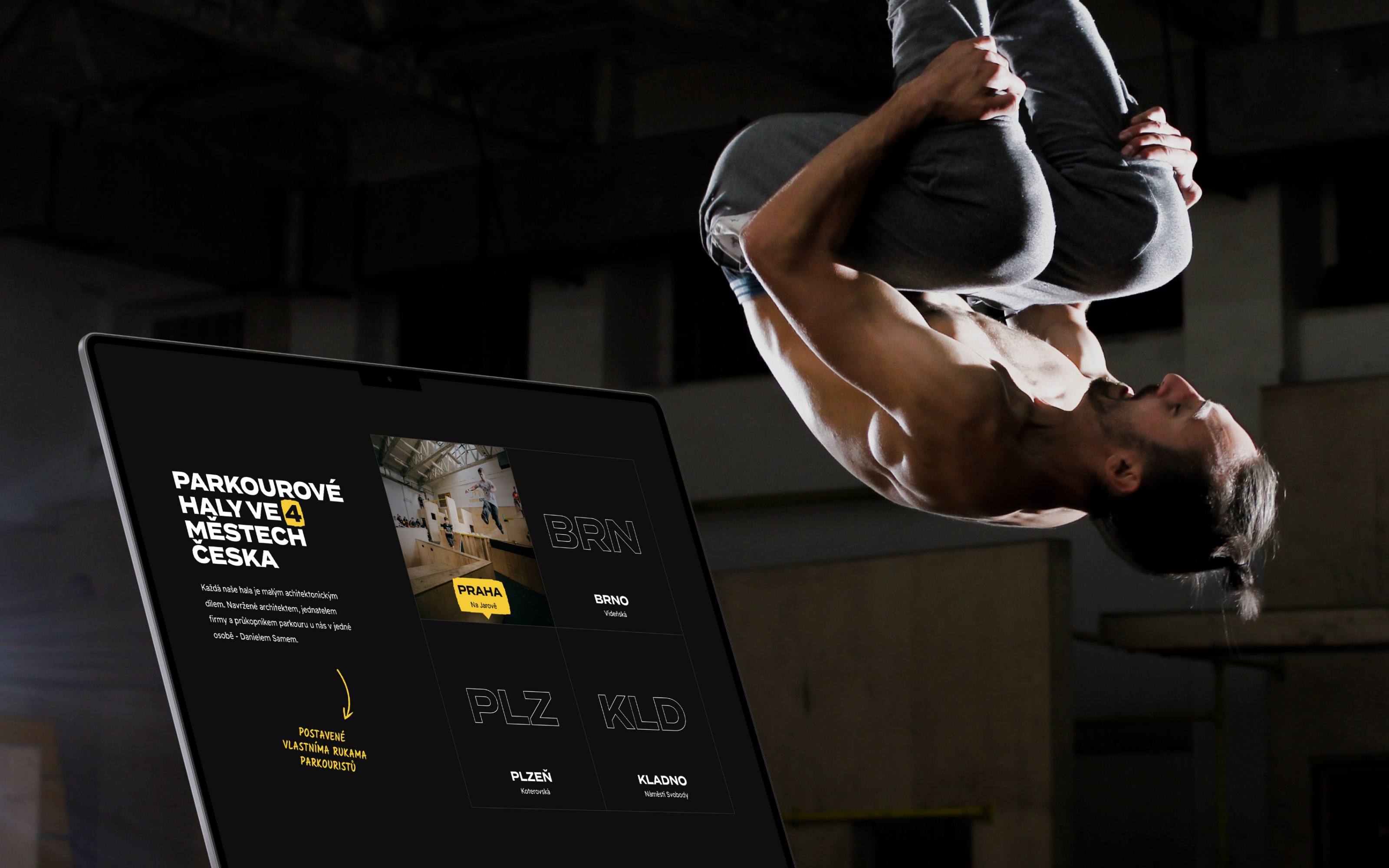
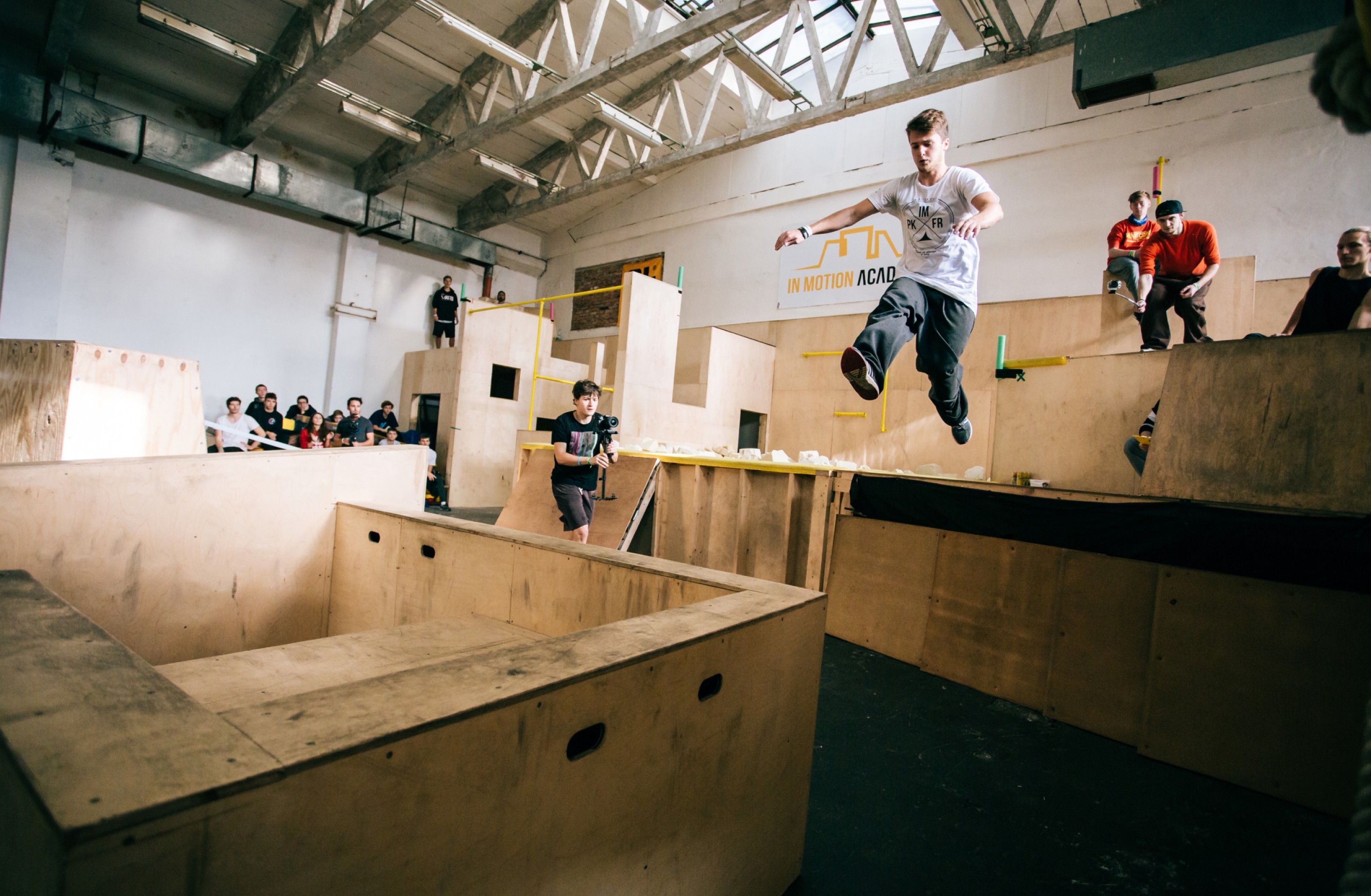
In Motion Academy offers various parkour training programs for individuals of all ages. They operate in 4 cities of Czechia - Prague, Brno, Plzeň and Kladno. They emphasise a playful and friendly approach to training with a focus on overall body development and safety. We were tasked with redesigning their website to enhance user engagement and improve the overall experience of its visitors.
In Motion Academy offers various parkour training programs for individuals of all ages. They operate in 4 cities of Czechia - Prague, Brno, Plzeň and Kladno. They emphasise a playful and friendly approach to training with a focus on overall body development and safety. We were tasked with redesigning their website to enhance user engagement and improve the overall experience of its visitors.
In Motion Academy offers various parkour training programs for individuals of all ages. They operate in 4 cities of Czechia - Prague, Brno, Plzeň and Kladno. They emphasise a playful and friendly approach to training with a focus on overall body development and safety. We were tasked with redesigning their website to enhance user engagement and improve the overall experience of its visitors.
In Motion Academy offers various parkour training programs for individuals of all ages. They operate in 4 cities of Czechia - Prague, Brno, Plzeň and Kladno. They emphasise a playful and friendly approach to training with a focus on overall body development and safety. We were tasked with redesigning their website to enhance user engagement and improve the overall experience of its visitors.
In Motion Academy offers various parkour training programs for individuals of all ages. They operate in 4 cities of Czechia - Prague, Brno, Plzeň and Kladno. They emphasise a playful and friendly approach to training with a focus on overall body development and safety. We were tasked with redesigning their website to enhance user engagement and improve the overall experience of its visitors.
In Motion Academy offers various parkour training programs for individuals of all ages. They operate in 4 cities of Czechia - Prague, Brno, Plzeň and Kladno. They emphasise a playful and friendly approach to training with a focus on overall body development and safety. We were tasked with redesigning their website to enhance user engagement and improve the overall experience of its visitors.
In Motion Academy offers various parkour training programs for individuals of all ages. They operate in 4 cities of Czechia - Prague, Brno, Plzeň and Kladno. They emphasise a playful and friendly approach to training with a focus on overall body development and safety. We were tasked with redesigning their website to enhance user engagement and improve the overall experience of its visitors.


CLIENT
CLIENT
CLIENT
CLIENT
In Motion Academy
In Motion Academy
In Motion Academy
In Motion Academy
In Motion Academy
CLIENT focus
CLIENT focus
CLIENT focus
CLIENT focus
Parkour gyms & trainings
Parkour gyms & trainings
Parkour gyms & trainings
Parkour gyms & trainings
Parkour gyms & trainings
type of work
type of work
type of work
type of work
Content Strategy
Content Strategy
Content Strategy
Content Strategy
Content Strategy
Visual Direction
Visual Direction
Visual Direction
Visual Direction
Visual Direction
UX/UI Design
UX/UI Design
UX/UI Design
UX/UI Design
UX/UI Design
Web Design
Web Design
Web Design
Web Design
Web Design
country & year
country & year
country & year
country & year
Czechia, 2022
Czechia, 2022
Czechia, 2022
Czechia, 2022
Czechia, 2022
CLIENT
In Motion Academy
CLIENT focus
Parkour gyms & trainings
type of work
Content Strategy
Visual Direction
UX/UI Design
Web Design
country & year
Czechia, 2022
CLIENT
In Motion Academy
CLIENT focus
Parkour gyms & trainings
type of work
Content Strategy
Visual Direction
UX/UI Design
Web Design
country & year
Czechia, 2022
CLIENT
In Motion Academy
CLIENT focus
Parkour gyms & trainings
type of work
Content Strategy
Visual Direction
UX/UI Design
Web Design
country & year
Czechia, 2022
THE CHALLENGE
THE CHALLENGE
THE CHALLENGE
THE CHALLENGE
THE CHALLENGE
THE CHALLENGE
Lack of navigational complexity, visual clarity & information overload
Lack of navigational complexity, visual clarity & information overload
Lack of navigational complexity, visual clarity & information overload
Lack of navigational complexity, visual clarity & information overload
Lack of navigational complexity, visual clarity & information overload
Lack of navigational complexity, visual clarity & information overload
Lack of navigational complexity, visual clarity & information overload
Lack of navigational complexity, visual clarity & information overload
Users found it difficult to locate specific courses due to a cluttered menu structure. The website was overloaded with text and visual clutter, deterring user engagement. It also lacked an efficient mobile interface, crucial for our target demographic of young, tech-savvy learners.
Users found it difficult to locate specific courses due to a cluttered menu structure. The website was overloaded with text and visual clutter, deterring user engagement. It also lacked an efficient mobile interface, crucial for our target demographic of young, tech-savvy learners.
Users found it difficult to locate specific courses due to a cluttered menu structure. The website was overloaded with text and visual clutter, deterring user engagement. It also lacked an efficient mobile interface, crucial for our target demographic of young, tech-savvy learners.
Users found it difficult to locate specific courses due to a cluttered menu structure. The website was overloaded with text and visual clutter, deterring user engagement. It also lacked an efficient mobile interface, crucial for our target demographic of young, tech-savvy learners.
Users found it difficult to locate specific courses due to a cluttered menu structure. The website was overloaded with text and visual clutter, deterring user engagement. It also lacked an efficient mobile interface, crucial for our target demographic of young, tech-savvy learners.
Users found it difficult to locate specific courses due to a cluttered menu structure. The website was overloaded with text and visual clutter, deterring user engagement. It also lacked an efficient mobile interface, crucial for our target demographic of young, tech-savvy learners.
Users found it difficult to locate specific courses due to a cluttered menu structure. The website was overloaded with text and visual clutter, deterring user engagement. It also lacked an efficient mobile interface, crucial for our target demographic of young, tech-savvy learners.






the opportunity
the opportunity
the opportunity
the opportunity
the opportunity
the opportunity
Redefined navigation, balanced content & efficient responsive design
Redefined navigation, balanced content & efficient responsive design
Redefined navigation, balanced content & efficient responsive design
Redefined navigation, balanced content & efficient responsive design
Redefined navigation, balanced content & efficient responsive design
Redefined navigation, balanced content & efficient responsive design
Redefined navigation, balanced content & efficient responsive design
Redefined navigation, balanced content & efficient responsive design
Implementing a simplified, intuitive navigation system and ensuring a consistent and engaging experience across all devices was desirable. When thinking about the UI, utilising visuals to complement textual information was something we focused on.
Implementing a simplified, intuitive navigation system and ensuring a consistent and engaging experience across all devices was desirable. When thinking about the UI, utilising visuals to complement textual information was something we focused on.
Implementing a simplified, intuitive navigation system and ensuring a consistent and engaging experience across all devices was desirable. When thinking about the UI, utilising visuals to complement textual information was something we focused on.
Implementing a simplified, intuitive navigation system and ensuring a consistent and engaging experience across all devices was desirable. When thinking about the UI, utilising visuals to complement textual information was something we focused on.
Implementing a simplified, intuitive navigation system and ensuring a consistent and engaging experience across all devices was desirable. When thinking about the UI, utilising visuals to complement textual information was something we focused on.
Implementing a simplified, intuitive navigation system and ensuring a consistent and engaging experience across all devices was desirable. When thinking about the UI, utilising visuals to complement textual information was something we focused on.
Implementing a simplified, intuitive navigation system and ensuring a consistent and engaging experience across all devices was desirable. When thinking about the UI, utilising visuals to complement textual information was something we focused on.
/01
/01
/01
/01
/01
/01
How might we simplify the website navigation to enhance user flow and ensure users find the information they need easily?
How might we simplify the website navigation to enhance user flow and ensure users find the information they need easily?
How might we simplify the website navigation to enhance user flow and ensure users find the information they need easily?
How might we simplify the website navigation to enhance user flow and ensure users find the information they need easily?
How might we simplify the website navigation to enhance user flow and ensure users find the information they need easily?
How might we simplify the website navigation to enhance user flow and ensure users find the information they need easily?
How might we simplify the website navigation to enhance user flow and ensure users find the information they need easily?
/02
/02
/02
/02
/02
/02
How might we simplify the UX of the training booking system so it's easy and more intuitive for users on both desktop and mobile devices?
How might we simplify the UX of the training booking system so it's easy and more intuitive for users on both desktop and mobile devices?
How might we simplify the UX of the training booking system so it's easy and more intuitive for users on both desktop and mobile devices?
How might we simplify the UX of the training booking system so it's easy and more intuitive for users on both desktop and mobile devices?
How might we simplify the UX of the training booking system so it's easy and more intuitive for users on both desktop and mobile devices?
How might we simplify the UX of the training booking system so it's easy and more intuitive for users on both desktop and mobile devices?
How might we simplify the UX of the training booking system so it's easy and more intuitive for users on both desktop and mobile devices?
/03
/03
/03
/03
/03
/03
How might we balance information and visuals to focus user attention effectively and maintain their engagement without overwhelming them?
How might we balance information and visuals to focus user attention effectively and maintain their engagement without overwhelming them?
How might we balance information and visuals to focus user attention effectively and maintain their engagement without overwhelming them?
How might we balance information and visuals to focus user attention effectively and maintain their engagement without overwhelming them?
How might we balance information and visuals to focus user attention effectively and maintain their engagement without overwhelming them?
How might we balance information and visuals to focus user attention effectively and maintain their engagement without overwhelming them?
How might we balance information and visuals to focus user attention effectively and maintain their engagement without overwhelming them?






THE SOLUTION
THE SOLUTION
THE SOLUTION
THE SOLUTION
THE SOLUTION
THE SOLUTION
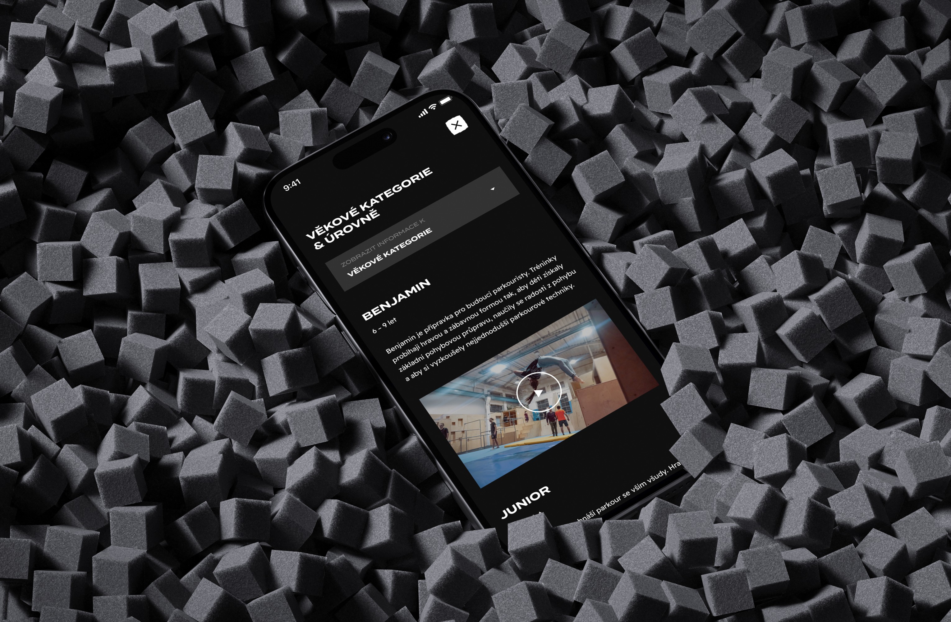
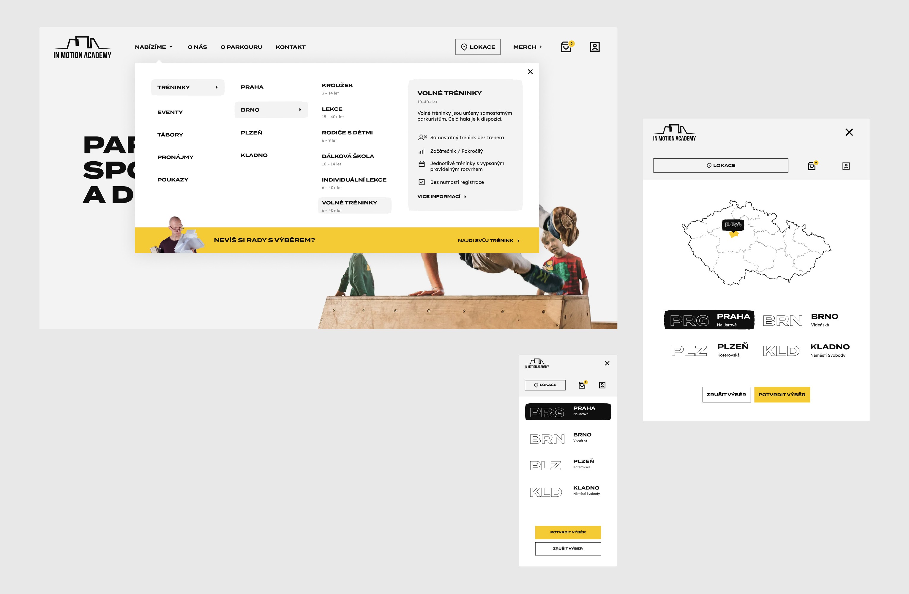
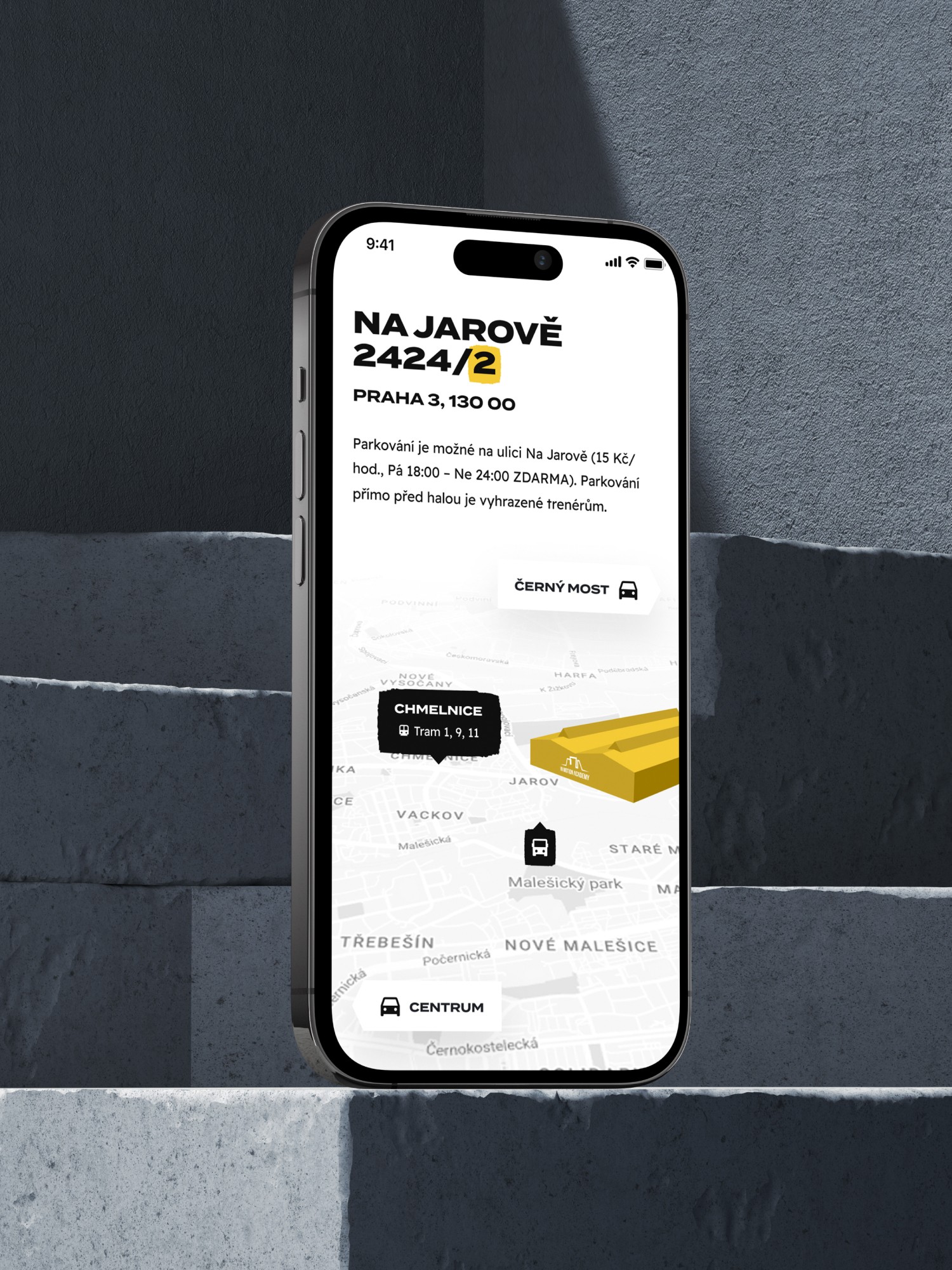
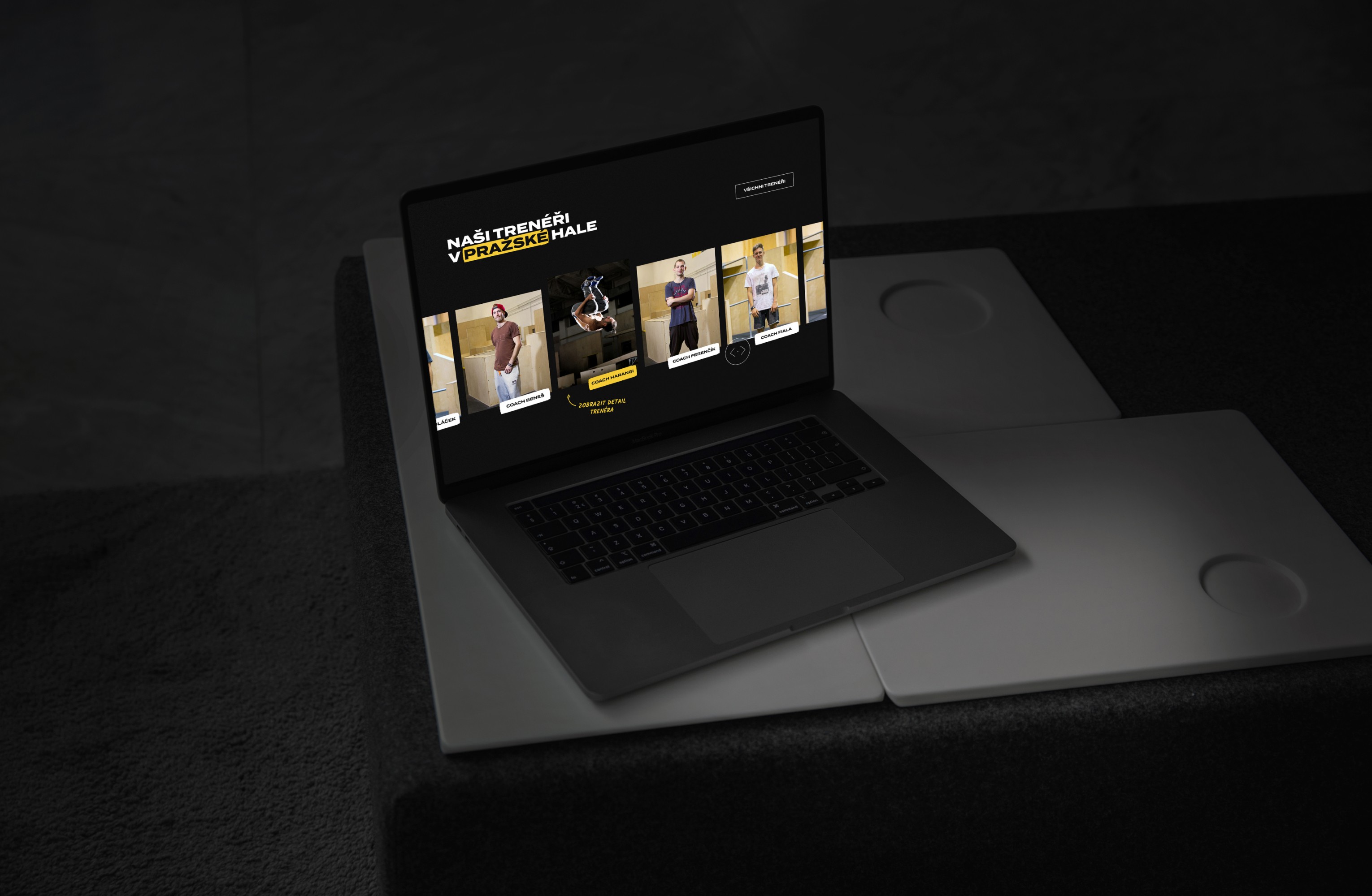
The UI was designed to be eye-catching and to reflect the architecture of the IMA’s parkour gyms and its solid parkour constructions. Together with the scratchy visual elements and bold and handwriting typography and it creates a truly personalised experience. The design also uses friendly cues for clear communication, ensuring users can find what they need quickly and effortlessly.
The UI was designed to be eye-catching and to reflect the architecture of the IMA’s parkour gyms and its solid parkour constructions. Together with the scratchy visual elements and bold and handwriting typography and it creates a truly personalised experience. The design also uses friendly cues for clear communication, ensuring users can find what they need quickly and effortlessly.
The UI was designed to be eye-catching and to reflect the architecture of the IMA’s parkour gyms and its solid parkour constructions. Together with the scratchy visual elements and bold and handwriting typography and it creates a truly personalised experience. The design also uses friendly cues for clear communication, ensuring users can find what they need quickly and effortlessly.
The UI was designed to be eye-catching and to reflect the architecture of the IMA’s parkour gyms and its solid parkour constructions. Together with the scratchy visual elements and bold and handwriting typography and it creates a truly personalised experience. The design also uses friendly cues for clear communication, ensuring users can find what they need quickly and effortlessly.
The UI was designed to be eye-catching and to reflect the architecture of the IMA’s parkour gyms and its solid parkour constructions. Together with the scratchy visual elements and bold and handwriting typography and it creates a truly personalised experience. The design also uses friendly cues for clear communication, ensuring users can find what they need quickly and effortlessly.
The UI was designed to be eye-catching and to reflect the architecture of the IMA’s parkour gyms and its solid parkour constructions. Together with the scratchy visual elements and bold and handwriting typography and it creates a truly personalised experience. The design also uses friendly cues for clear communication, ensuring users can find what they need quickly and effortlessly.
The UI was designed to be eye-catching and to reflect the architecture of the IMA’s parkour gyms and its solid parkour constructions. Together with the scratchy visual elements and bold and handwriting typography and it creates a truly personalised experience. The design also uses friendly cues for clear communication, ensuring users can find what they need quickly and effortlessly.
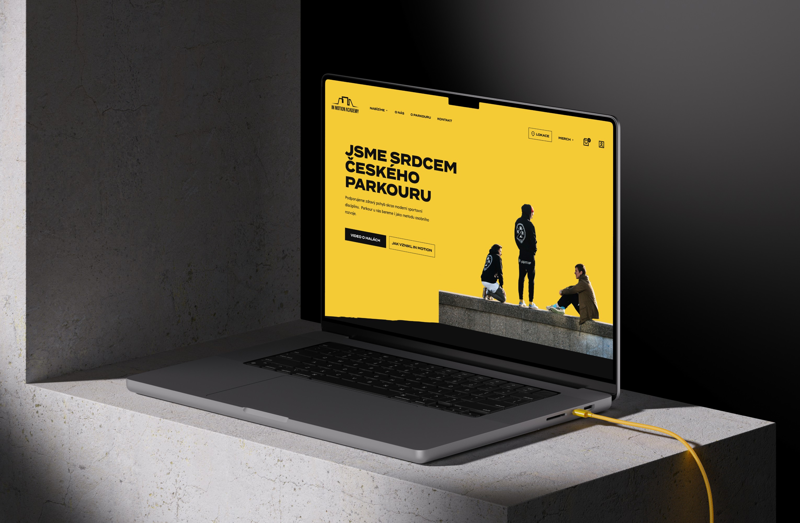


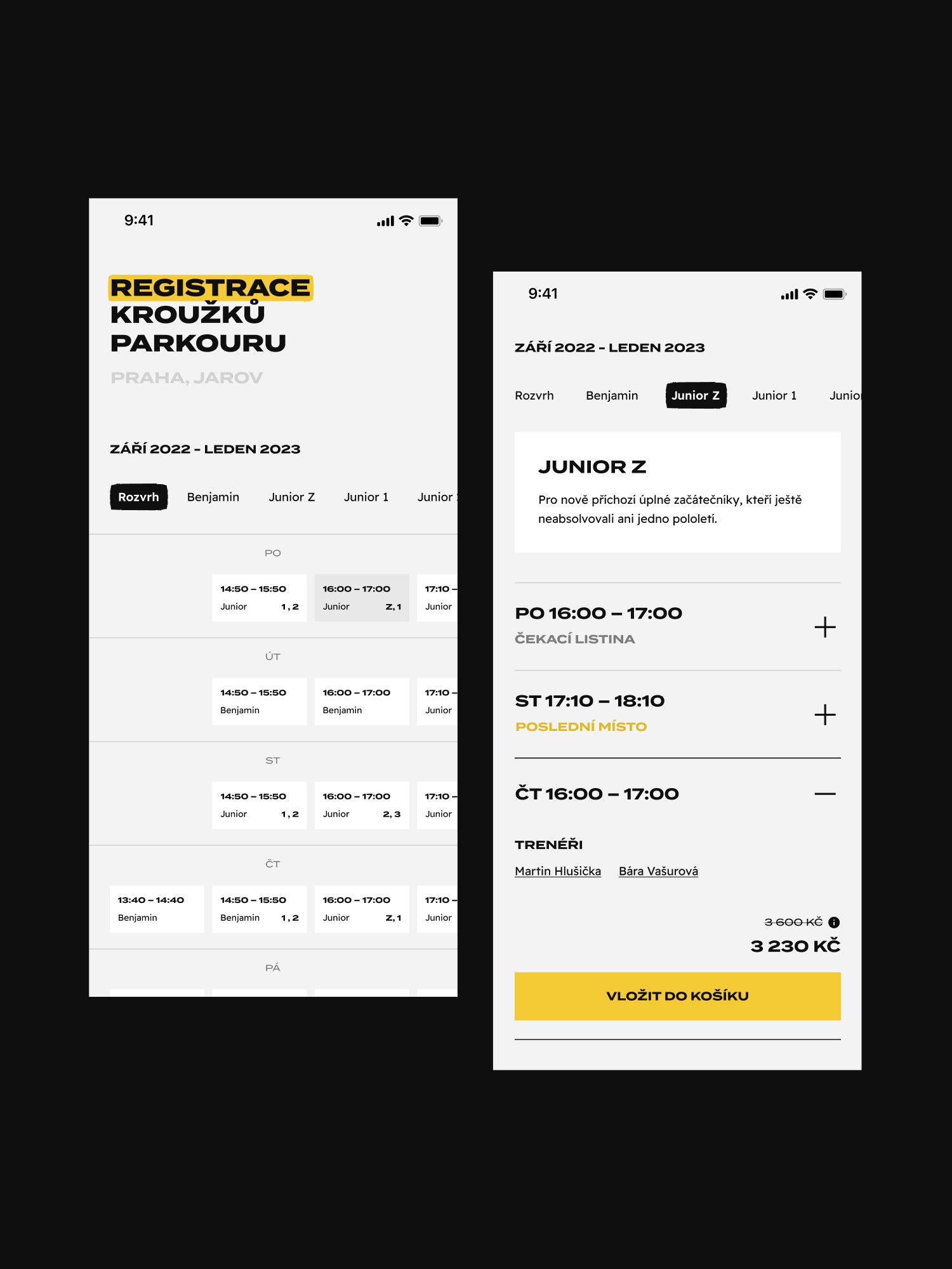
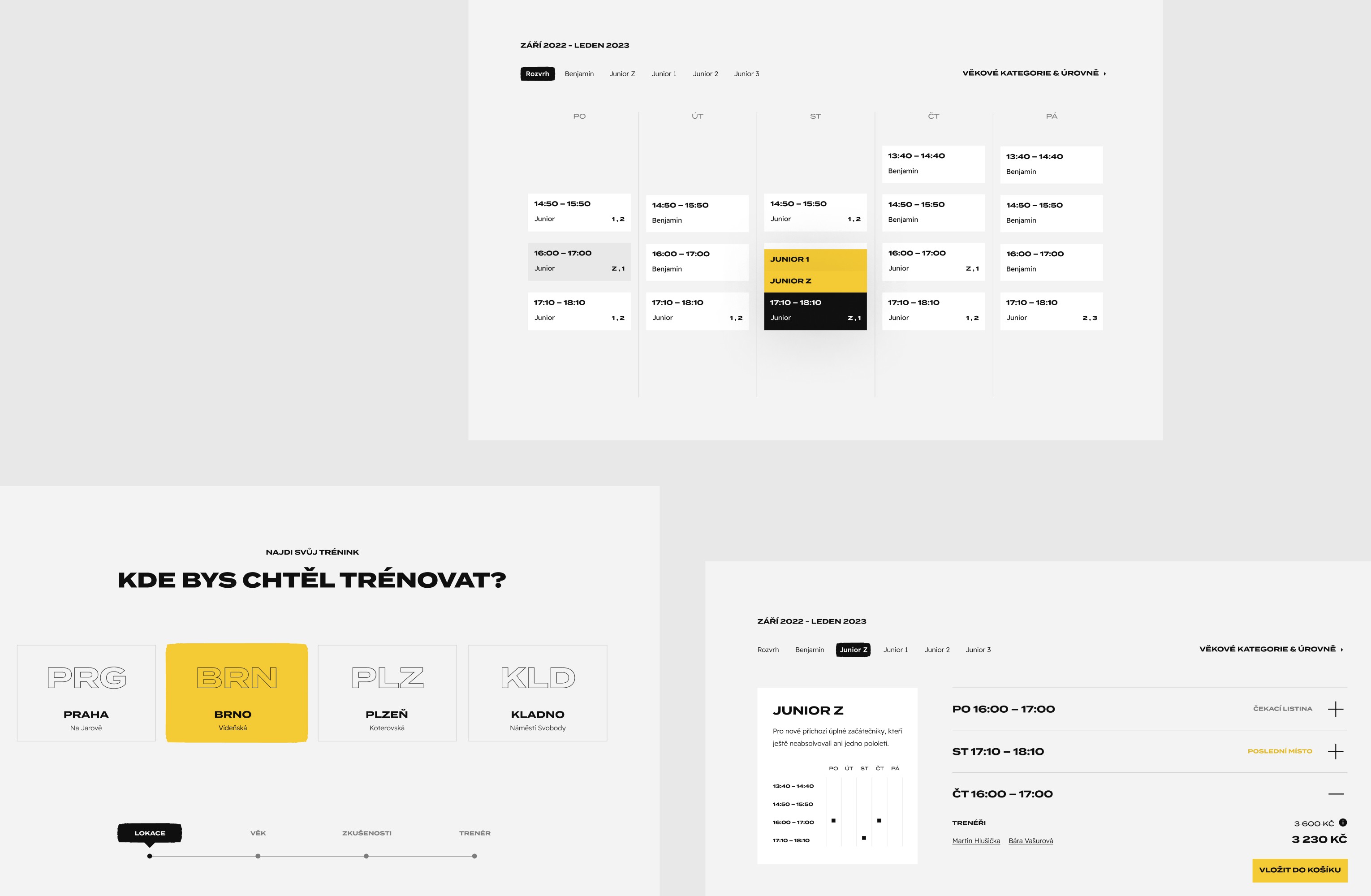
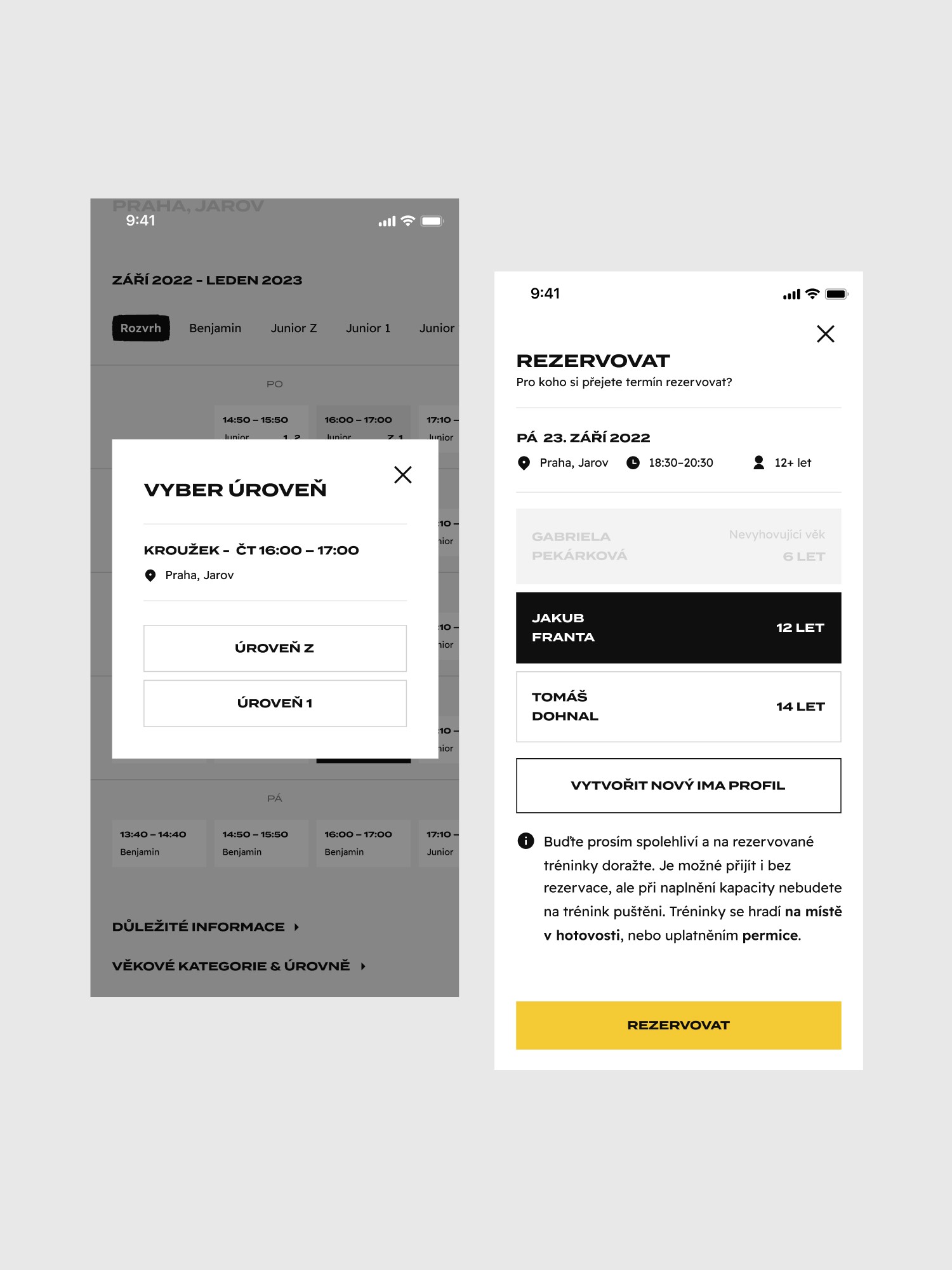
We completely redesigned the website’s UX/UI. We reorganized the way information was presented to the user, making it easier to find and understand. We adopted a cleaner, more intuitive layout and visual style that prioritises important actions. We ensured that call-to-action buttons like were prominently displayed and clearly labeled.
We developed a personalised course recommendation system based on user profile to simplify the booking flow. We also ensured that users received clear confirmation messages post-booking, along with follow-up emails containing all necessary details.


THE result
THE result
THE result
THE result
THE result
THE result
Increased efficiency & higher satisfaction
Increased efficiency & higher satisfaction
Increased efficiency & higher satisfaction
Increased efficiency & higher satisfaction
Increased efficiency & higher satisfaction
Increased efficiency & higher satisfaction
Increased efficiency & higher satisfaction
Increased efficiency & higher satisfaction
By focusing on user needs, simplifying processes, and enhancing the overall aesthetic and functionality, we created a booking experience that is not only easy and efficient but also enjoyable for the user.
The booking process became significantly faster and more efficient, reducing the time users spent on the system.
User satisfaction improved due to the streamlined process and intuitive design.


"Never before have I so seamless and integrated experience. I was most impressed with how they were able to balance their creative process with our needs and desires. They are very professinal about explaining their design decisions and able to make compromises in order to satisfy client's needs."
"Never before have I so seamless and integrated experience. I was most impressed with how they were able to balance their creative process with our needs and desires. They are very professinal about explaining their design decisions and able to make compromises in order to satisfy client's needs."
"Never before have I so seamless and integrated experience. I was most impressed with how they were able to balance their creative process with our needs and desires. They are very professinal about explaining their design decisions and able to make compromises in order to satisfy client's needs."
"Never before have I so seamless and integrated experience. I was most impressed with how they were able to balance their creative process with our needs and desires. They are very professinal about explaining their design decisions and able to make compromises in order to satisfy client's needs."
"Never before have I so seamless and integrated experience. I was most impressed with how they were able to balance their creative process with our needs and desires. They are very professinal about explaining their design decisions and able to make compromises in order to satisfy client's needs."

Tomáš Dohnal
Tomáš Dohnal
Tomáš Dohnal
Tomáš Dohnal
Tomáš Dohnal
MARKETING DEPARTMENT, IN MOTION ACADEMY
MARKETING DEPARTMENT, IN MOTION ACADEMY
MARKETING DEPARTMENT, IN MOTION ACADEMY
MARKETING DEPARTMENT, IN MOTION ACADEMY


Clutch review


Clutch review
125 %
125 %
125 %
125 %
125 %
Increase in mobile traffic
Increase in mobile traffic
Increase in mobile traffic
Increase in mobile traffic
Increase in mobile traffic
150 %
150 %
150 %
150 %
150 %
Increase in user engagement
Increase in user engagement
Increase in user engagement
Increase in user engagement
Increase in user engagement
125 %
Increase in mobile traffic
150 %
Increase in user engagement
125 %
Increase in mobile traffic
150 %
Increase in user engagement
125 %
Increase in mobile traffic
150 %
Increase in user engagement
The website Brazen® created for me exceeded my expectations in every way. It's beautiful, functional, and exactly what I was looking for. I couldn't be happier with the results.
"Never before have I so seamless and integrated experience. I was most impressed with how they were able to balance their creative process with our needs and desires. They are very professinal about explaining their design decisions and able to make compromises in order to satisfy client's needs."
"Never before have I so seamless and integrated experience. I was most impressed with how they were able to balance their creative process with our needs and desires. They are very professinal about explaining their design decisions and able to make compromises in order to satisfy client's needs."
"Never before have I so seamless and integrated experience. I was most impressed with how they were able to balance their creative process with our needs and desires. They are very professinal about explaining their design decisions and able to make compromises in order to satisfy client's needs."


Benjamin Anderson
Tomáš Dohnal
Tomáš Dohnal
Tomáš Dohnal
FOUNDER & CEO
MARKETING DEPARTMENT, IN MOTION ACADEMY
MARKETING DEPARTMENT, IN MOTION ACADEMY
MARKETING DEPARTMENT, IN MOTION ACADEMY


Clutch review
