TRANSFORMING HOME MANAGEMENT
TRANSFORMING HOME MANAGEMENT
TRANSFORMING HOME MANAGEMENT
TRANSFORMING HOME MANAGEMENT FOR PROPERTY OWNERS
& TENANTS
TRANSFORMING HOME MANAGEMENT
TRANSFORMING HOME MANAGEMENT FOR PROPERTY OWNERS
& TENANTS
TRANSFORMING HOME MANAGEMENT
TRANSFORMING HOME MANAGEMENT FOR PROPERTY OWNERS
& TENANTES
FOR PROPERTY OWNERS & TENANTS
FOR PROPERTY OWNERS & TENANTS
FOR PROPERTY OWNERS & TENANTS
FOR PROPERTY OWNERS & TENANTS
FOR PROPERTY OWNERS & TENANTS
PROJECT OVERVIEW
PROJECT OVERVIEW
PROJECT OVERVIEW
PROJECT OVERVIEW
PROJECT OVERVIEW
PROJECT OVERVIEW
Nexuri is a comprehensive smart home management solution designed to give users complete control over their property. Whether you are a property owner or tenant, Nexuri offers real-time insights and centralized management of various home systems. The system includes a central control unit and an intuitive app, allowing users to manage energy consumption, control devices like lights, doors, and heating systems, and handle billing and contracts with ease. By integrating everything into a single platform, Nexuri elevates home management to a new level of convenience and control. We were tasked with naming, branding and webdesign.
Nexuri is a comprehensive smart home management solution designed to give users complete control over their property. Whether you are a property owner or tenant, Nexuri offers real-time insights and centralized management of various home systems. The system includes a central control unit and an intuitive app, allowing users to manage energy consumption, control devices like lights, doors, and heating systems, and handle billing and contracts with ease. By integrating everything into a single platform, Nexuri elevates home management to a new level of convenience and control. We were tasked with naming, branding and webdesign.
Nexuri is a comprehensive smart home management solution designed to give users complete control over their property. Whether you are a property owner or tenant, Nexuri offers real-time insights and centralized management of various home systems. The system includes a central control unit and an intuitive app, allowing users to manage energy consumption, control devices like lights, doors, and heating systems, and handle billing and contracts with ease. By integrating everything into a single platform, Nexuri elevates home management to a new level of convenience and control. We were tasked with naming, branding and webdesign.
Nexuri is a comprehensive smart home management solution designed to give users complete control over their property. Whether you are a property owner or tenant, Nexuri offers real-time insights and centralized management of various home systems. The system includes a central control unit and an intuitive app, allowing users to manage energy consumption, control devices like lights, doors, and heating systems, and handle billing and contracts with ease. By integrating everything into a single platform, Nexuri elevates home management to a new level of convenience and control. We were tasked with naming, branding and webdesign.
Nexuri is a comprehensive smart home management solution designed to give users complete control over their property. Whether you are a property owner or tenant, Nexuri offers real-time insights and centralized management of various home systems. The system includes a central control unit and an intuitive app, allowing users to manage energy consumption, control devices like lights, doors, and heating systems, and handle billing and contracts with ease. By integrating everything into a single platform, Nexuri elevates home management to a new level of convenience and control. We were tasked with naming, branding and webdesign.
Nexuri is a comprehensive smart home management solution designed to give users complete control over their property. Whether you are a property owner or tenant, Nexuri offers real-time insights and centralized management of various home systems. The system includes a central control unit and an intuitive app, allowing users to manage energy consumption, control devices like lights, doors, and heating systems, and handle billing and contracts with ease. By integrating everything into a single platform, Nexuri elevates home management to a new level of convenience and control. We were tasked with naming, branding and webdesign.
Nexuri is a comprehensive smart home management solution designed to give users complete control over their property. Whether you are a property owner or tenant, Nexuri offers real-time insights and centralized management of various home systems. The system includes a central control unit and an intuitive app, allowing users to manage energy consumption, control devices like lights, doors, and heating systems, and handle billing and contracts with ease. By integrating everything into a single platform, Nexuri elevates home management to a new level of convenience and control. We were tasked with naming, branding and webdesign.


CLIENT
CLIENT
CLIENT
CLIENT
Nexuri (Created for ExDuris)
Nexuri (Created for ExDuris)
Nexuri (Created for ExDuris)
Nexuri (Created for ExDuris)
Nexuri (Created for ExDuris)
CLIENT focus
CLIENT focus
CLIENT focus
CLIENT focus
Smart home management
Smart home management
Smart home management
Smart home management
Smart home management
type of work
type of work
type of work
type of work
Naming
Naming
Naming
Naming
Naming
Branding & Strategy
Branding & Strategy
Branding & Strategy
Branding & Strategy
Branding & Strategy
Web Design
Web Design
Web Design
Web Design
Web Design
country & year
country & year
country & year
country & year
Czechia, 2024
Czechia, 2024
Czechia, 2024
Czechia, 2024
Czechia, 2024
The copyright for the images used in this case study is owned by Escalate Ltd
The copyright for the images used in this case study is owned by Escalate Ltd
The copyright for the images used in this case study is owned by Escalate Ltd
The copyright for the images used in this case study is owned by Escalate Ltd
The copyright for the images used in this case study is owned by Escalate Ltd
CLIENT
Nexuri (Created for ExDuris)
CLIENT focus
Smart home management
type of work
Naming
Branding & Strategy
Web Design
country & year
Czechia, 2024
The copyright for the images used in this case study is owned by Escalate Ltd
CLIENT
Nexuri (Created for ExDuris)
CLIENT focus
Smart home management
type of work
Naming
Branding & Strategy
Web Design
country & year
Czechia, 2024
The copyright for the images used in this case study is owned by Escalate Ltd
CLIENT
Nexuri (Created for ExDuris)
CLIENT focus
Smart home management
type of work
Naming
Branding & Strategy
Web Design
country & year
Czechia, 2024
The copyright for the images used in this case study is owned by Escalate Ltd
THE NAMING
THE NAMING
THE NAMING
THE NAMING
THE NAMING
THE NAMING
“Nexus” = the central point of everything
“Nexus” = the central point of everything
“Nexus” = the central point of everything
“Nexus” = the central point of everything
“Nexus” = the central point of everything
“Nexus” = the central point of everything
“Nexus” = the central point of everything
“Nexus” = the central point of everything
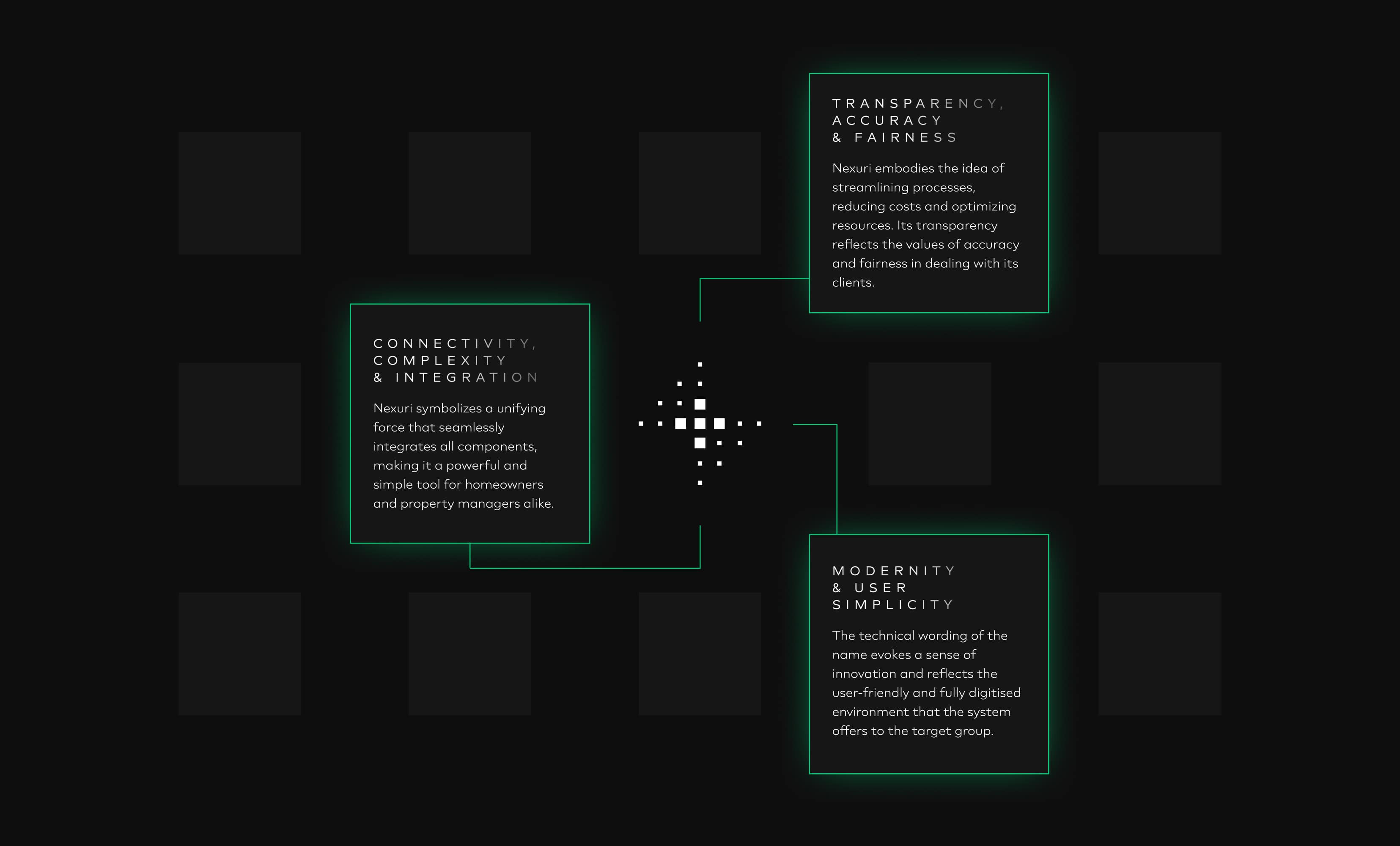
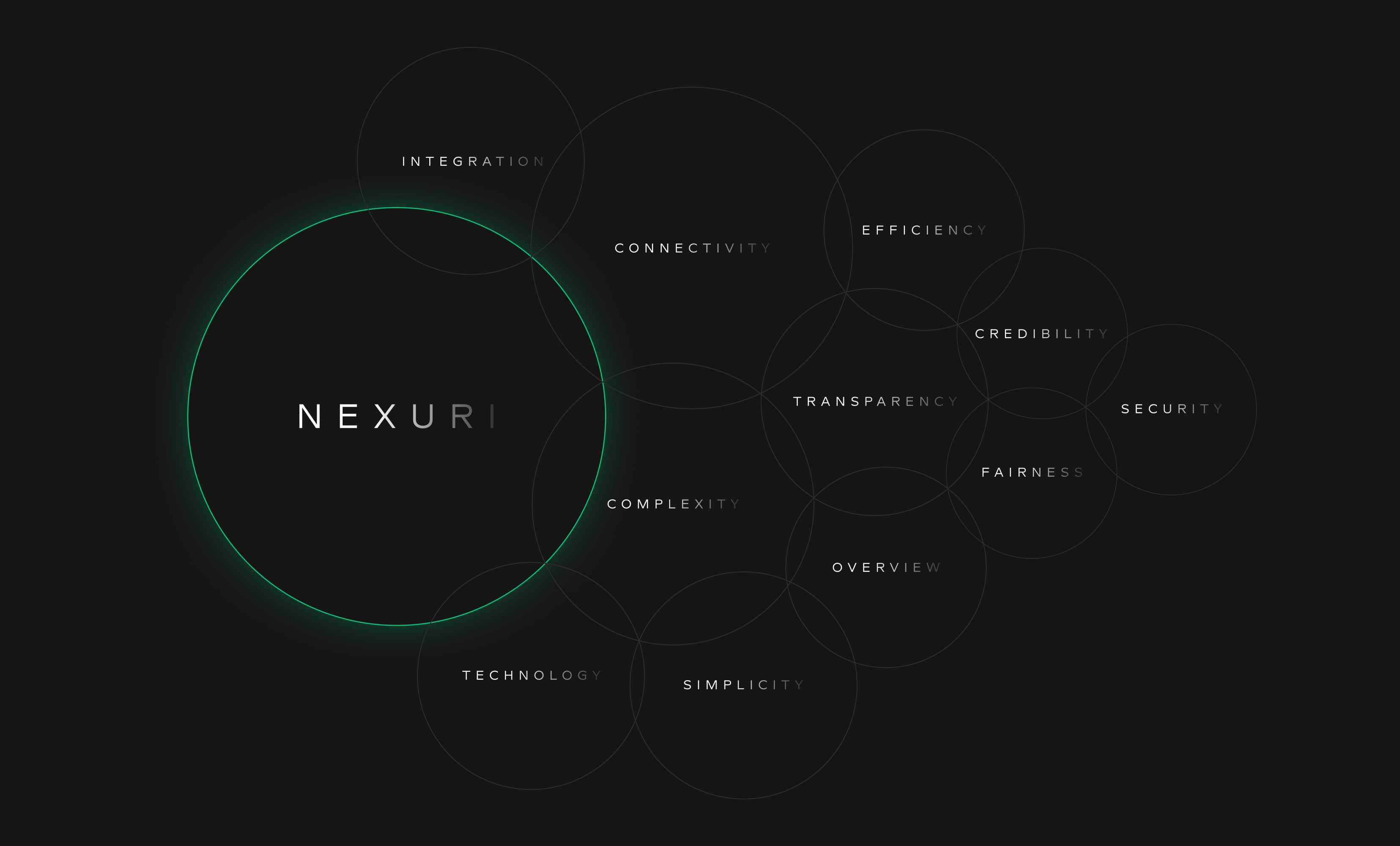
The inspiration for naming came from the word “Nexus,” representing a central connection point where everything converges. We chose "Nexuri" to reflect this concept, symbolizing the system’s role as the central hub of the home. The name carries connotations of connectivity, intelligence, and seamless integration, aligning perfectly with the product’s purpose. By giving it a sleek, tech-forward identity, we reinforced the idea that Nexuri isn’t just a tool, but the “brain” that empowers users to take full control of their environment. This thoughtful naming set the foundation for building a cohesive and forward-looking brand identity.
The inspiration for naming came from the word “Nexus,” representing a central connection point where everything converges. We chose "Nexuri" to reflect this concept, symbolizing the system’s role as the central hub of the home. The name carries connotations of connectivity, intelligence, and seamless integration, aligning perfectly with the product’s purpose. By giving it a sleek, tech-forward identity, we reinforced the idea that Nexuri isn’t just a tool, but the “brain” that empowers users to take full control of their environment. This thoughtful naming set the foundation for building a cohesive and forward-looking brand identity.
The inspiration for naming came from the word “Nexus,” representing a central connection point where everything converges. We chose "Nexuri" to reflect this concept, symbolizing the system’s role as the central hub of the home. The name carries connotations of connectivity, intelligence, and seamless integration, aligning perfectly with the product’s purpose. By giving it a sleek, tech-forward identity, we reinforced the idea that Nexuri isn’t just a tool, but the “brain” that empowers users to take full control of their environment. This thoughtful naming set the foundation for building a cohesive and forward-looking brand identity.
The inspiration for naming came from the word “Nexus,” representing a central connection point where everything converges. We chose "Nexuri" to reflect this concept, symbolizing the system’s role as the central hub of the home. The name carries connotations of connectivity, intelligence, and seamless integration, aligning perfectly with the product’s purpose. By giving it a sleek, tech-forward identity, we reinforced the idea that Nexuri isn’t just a tool, but the “brain” that empowers users to take full control of their environment. This thoughtful naming set the foundation for building a cohesive and forward-looking brand identity.
The inspiration for naming came from the word “Nexus,” representing a central connection point where everything converges. We chose "Nexuri" to reflect this concept, symbolizing the system’s role as the central hub of the home. The name carries connotations of connectivity, intelligence, and seamless integration, aligning perfectly with the product’s purpose. By giving it a sleek, tech-forward identity, we reinforced the idea that Nexuri isn’t just a tool, but the “brain” that empowers users to take full control of their environment. This thoughtful naming set the foundation for building a cohesive and forward-looking brand identity.
The inspiration for naming came from the word “Nexus,” representing a central connection point where everything converges. We chose "Nexuri" to reflect this concept, symbolizing the system’s role as the central hub of the home. The name carries connotations of connectivity, intelligence, and seamless integration, aligning perfectly with the product’s purpose. By giving it a sleek, tech-forward identity, we reinforced the idea that Nexuri isn’t just a tool, but the “brain” that empowers users to take full control of their environment. This thoughtful naming set the foundation for building a cohesive and forward-looking brand identity.
The inspiration for naming came from the word “Nexus,” representing a central connection point where everything converges. We chose "Nexuri" to reflect this concept, symbolizing the system’s role as the central hub of the home. The name carries connotations of connectivity, intelligence, and seamless integration, aligning perfectly with the product’s purpose. By giving it a sleek, tech-forward identity, we reinforced the idea that Nexuri isn’t just a tool, but the “brain” that empowers users to take full control of their environment. This thoughtful naming set the foundation for building a cohesive and forward-looking brand identity.


the CHALLENGE
the CHALLENGE
the CHALLENGE
the CHALLENGE
the CHALLENGE
the CHALLENGE
Blending futuristic sophistication with premium design
Blending futuristic sophistication with premium design
Blending futuristic sophistication with premium design
Blending futuristic sophistication with premium design
Blending futuristic sophistication with premium design
Blending futuristic sophistication with premium design
Blending futuristic sophistication with premium design
Blending futuristic sophistication with premium design
Before starting the branding process for Nexuri, we needed to establish a strong foundation that communicated the system's technical sophistication while remaining approachable for a wide range of users. The key challenge was how to visually represent a product that acts as the “brain” of the home—complex in its functionality, yet designed to simplify daily life. We needed to ensure that the visual identity felt premium, reflecting the high-quality of the product, while still being inviting and easy to interact with, for users ranging from homeowners to building managers.
Before starting the branding process for Nexuri, we needed to establish a strong foundation that communicated the system's technical sophistication while remaining approachable for a wide range of users. The key challenge was how to visually represent a product that acts as the “brain” of the home—complex in its functionality, yet designed to simplify daily life. We needed to ensure that the visual identity felt premium, reflecting the high-quality of the product, while still being inviting and easy to interact with, for users ranging from homeowners to building managers.
Before starting the branding process for Nexuri, we needed to establish a strong foundation that communicated the system's technical sophistication while remaining approachable for a wide range of users. The key challenge was how to visually represent a product that acts as the “brain” of the home—complex in its functionality, yet designed to simplify daily life. We needed to ensure that the visual identity felt premium, reflecting the high-quality of the product, while still being inviting and easy to interact with, for users ranging from homeowners to building managers.
Before starting the branding process for Nexuri, we needed to establish a strong foundation that communicated the system's technical sophistication while remaining approachable for a wide range of users. The key challenge was how to visually represent a product that acts as the “brain” of the home—complex in its functionality, yet designed to simplify daily life. We needed to ensure that the visual identity felt premium, reflecting the high-quality of the product, while still being inviting and easy to interact with, for users ranging from homeowners to building managers.
Before starting the branding process for Nexuri, we needed to establish a strong foundation that communicated the system's technical sophistication while remaining approachable for a wide range of users. The key challenge was how to visually represent a product that acts as the “brain” of the home—complex in its functionality, yet designed to simplify daily life. We needed to ensure that the visual identity felt premium, reflecting the high-quality of the product, while still being inviting and easy to interact with, for users ranging from homeowners to building managers.
Before starting the branding process for Nexuri, we needed to establish a strong foundation that communicated the system's technical sophistication while remaining approachable for a wide range of users. The key challenge was how to visually represent a product that acts as the “brain” of the home—complex in its functionality, yet designed to simplify daily life. We needed to ensure that the visual identity felt premium, reflecting the high-quality of the product, while still being inviting and easy to interact with, for users ranging from homeowners to building managers.
Before starting the branding process for Nexuri, we needed to establish a strong foundation that communicated the system's technical sophistication while remaining approachable for a wide range of users. The key challenge was how to visually represent a product that acts as the “brain” of the home—complex in its functionality, yet designed to simplify daily life. We needed to ensure that the visual identity felt premium, reflecting the high-quality of the product, while still being inviting and easy to interact with, for users ranging from homeowners to building managers.
/01
/01
/01
/01
/01
/01
How do we balance a futuristic, tech-driven aesthetic with user-friendly appeal?
How do we balance a futuristic, tech-driven aesthetic with user-friendly appeal?
How do we balance a futuristic, tech-driven aesthetic with user-friendly appeal?
How do we balance a futuristic, tech-driven aesthetic with user-friendly appeal?
How do we balance a futuristic, tech-driven aesthetic with user-friendly appeal?
How do we balance a futuristic, tech-driven aesthetic with user-friendly appeal?
How do we balance a futuristic, tech-driven aesthetic with user-friendly appeal?
/02
/02
/02
/02
/02
/02
How can we create a brand identity that feels trustworthy, modern, and intuitive?
How can we create a brand identity that feels trustworthy, modern, and intuitive?
How can we create a brand identity that feels trustworthy, modern, and intuitive?
How can we create a brand identity that feels trustworthy, modern, and intuitive?
How can we create a brand identity that feels trustworthy, modern, and intuitive?
How can we create a brand identity that feels trustworthy, modern, and intuitive?
How can we create a brand identity that feels trustworthy, modern, and intuitive?
/03
/03
/03
/03
/03
/03
How can we differentiate Nexuri from other smart home solutions?
How can we differentiate Nexuri from other smart home solutions?
How can we differentiate Nexuri from other smart home solutions?
How can we differentiate Nexuri from other smart home solutions?
How can we differentiate Nexuri from other smart home solutions?
How can we differentiate Nexuri from other smart home solutions?
How can we differentiate Nexuri from other smart home solutions?
the SOLUTION
the SOLUTION
the SOLUTION
the SOLUTION
the SOLUTION
the SOLUTION
Geometry that empowers, simplicity that connects
Geometry that empowers, simplicity that connects
Geometry that empowers, simplicity that connects
Geometry that empowers, simplicity that connects
Geometry that empowers, simplicity that connects
Geometry that empowers, simplicity that connects
Geometry that empowers, simplicity that connects
Geometry that empowers, simplicity that connects
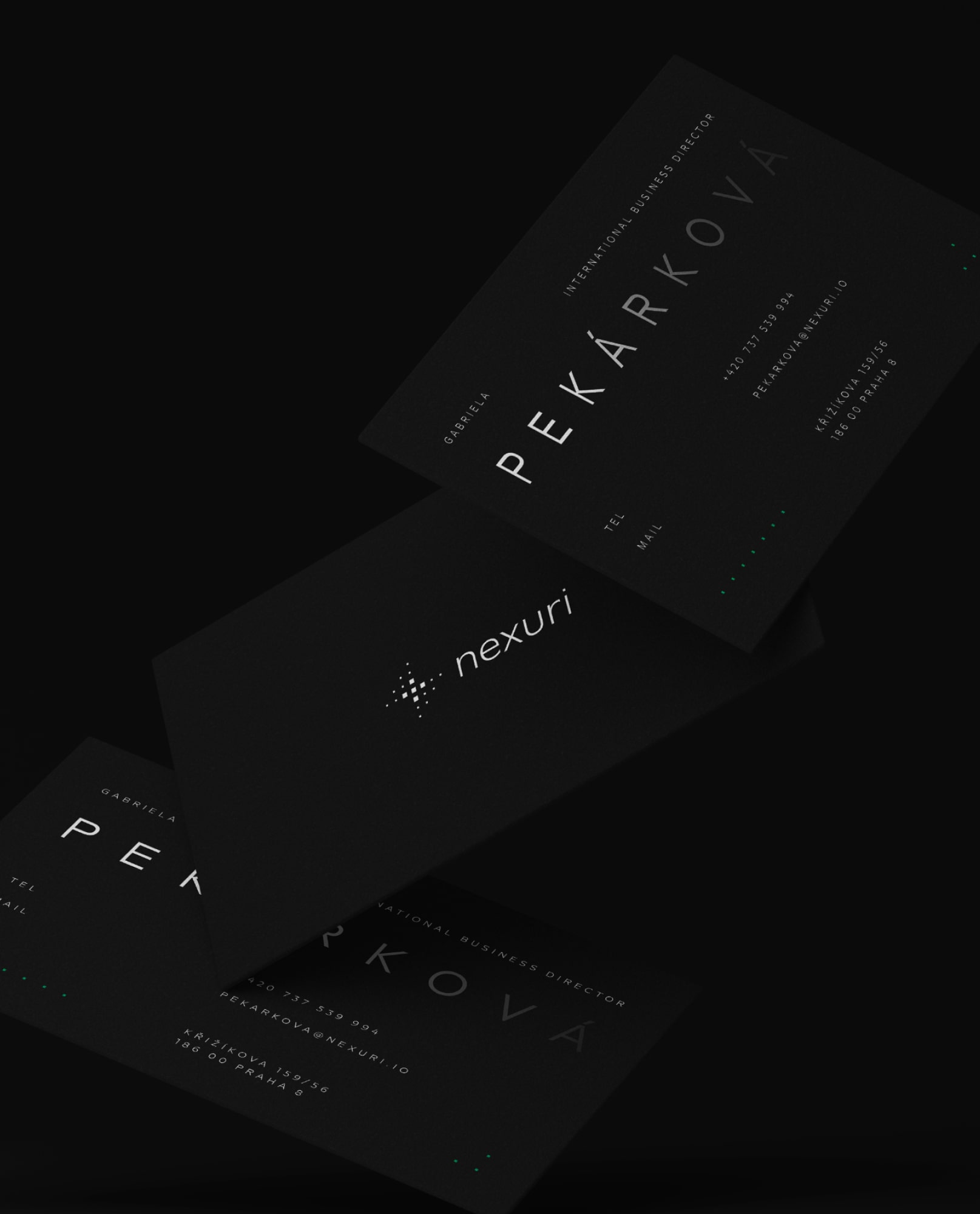
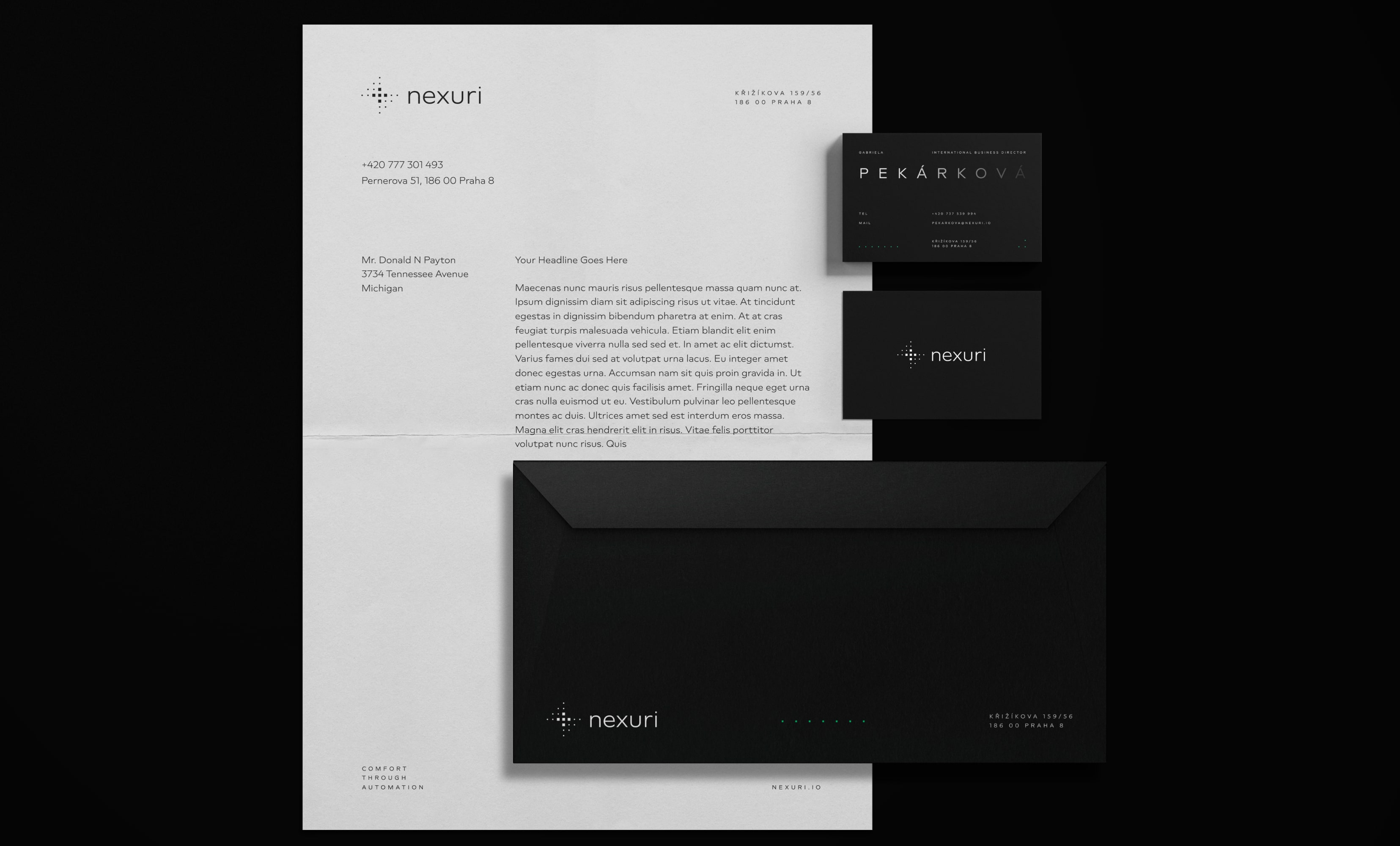
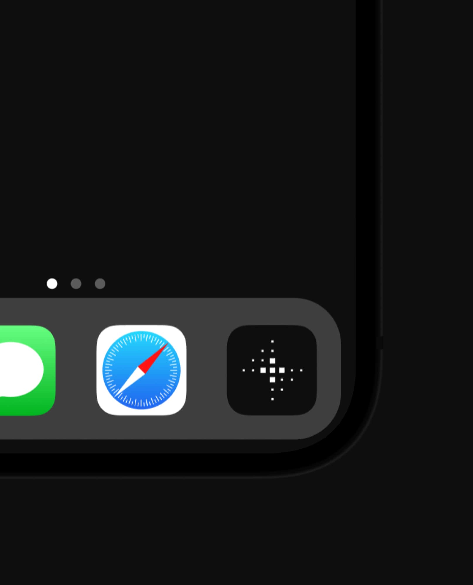
We built a minimalist, sleek design language that emphasized clarity and control. The logo we crafted is a powerful representation of connection and innovation, masterfully intertwining geometric form and symbolism. At its core, the design embodies the letter "N," constructed from a series of interlocking cubes that converge at a central point. The logo embodies the concept of multifunctionality. Each cube represents individual elements or ideas, emphasizing how diverse components can come together to create a cohesive whole. Furthermore, the logo symbolises a signal that represents the brand's mission to facilitate connections in an increasingly complex world.
We built a minimalist, sleek design language that emphasized clarity and control. The logo we crafted is a powerful representation of connection and innovation, masterfully intertwining geometric form and symbolism. At its core, the design embodies the letter "N," constructed from a series of interlocking cubes that converge at a central point. The logo embodies the concept of multifunctionality. Each cube represents individual elements or ideas, emphasizing how diverse components can come together to create a cohesive whole. Furthermore, the logo symbolises a signal that represents the brand's mission to facilitate connections in an increasingly complex world.
We built a minimalist, sleek design language that emphasized clarity and control. The logo we crafted is a powerful representation of connection and innovation, masterfully intertwining geometric form and symbolism. At its core, the design embodies the letter "N," constructed from a series of interlocking cubes that converge at a central point. The logo embodies the concept of multifunctionality. Each cube represents individual elements or ideas, emphasizing how diverse components can come together to create a cohesive whole. Furthermore, the logo symbolises a signal that represents the brand's mission to facilitate connections in an increasingly complex world.
We built a minimalist, sleek design language that emphasized clarity and control. The logo we crafted is a powerful representation of connection and innovation, masterfully intertwining geometric form and symbolism. At its core, the design embodies the letter "N," constructed from a series of interlocking cubes that converge at a central point. The logo embodies the concept of multifunctionality. Each cube represents individual elements or ideas, emphasizing how diverse components can come together to create a cohesive whole. Furthermore, the logo symbolises a signal that represents the brand's mission to facilitate connections in an increasingly complex world.
We built a minimalist, sleek design language that emphasized clarity and control. The logo we crafted is a powerful representation of connection and innovation, masterfully intertwining geometric form and symbolism. At its core, the design embodies the letter "N," constructed from a series of interlocking cubes that converge at a central point. The logo embodies the concept of multifunctionality. Each cube represents individual elements or ideas, emphasizing how diverse components can come together to create a cohesive whole. Furthermore, the logo symbolises a signal that represents the brand's mission to facilitate connections in an increasingly complex world.
We built a minimalist, sleek design language that emphasized clarity and control. The logo we crafted is a powerful representation of connection and innovation, masterfully intertwining geometric form and symbolism. At its core, the design embodies the letter "N," constructed from a series of interlocking cubes that converge at a central point. The logo embodies the concept of multifunctionality. Each cube represents individual elements or ideas, emphasizing how diverse components can come together to create a cohesive whole. Furthermore, the logo symbolises a signal that represents the brand's mission to facilitate connections in an increasingly complex world.
We built a minimalist, sleek design language that emphasized clarity and control. The logo we crafted is a powerful representation of connection and innovation, masterfully intertwining geometric form and symbolism. At its core, the design embodies the letter "N," constructed from a series of interlocking cubes that converge at a central point. The logo embodies the concept of multifunctionality. Each cube represents individual elements or ideas, emphasizing how diverse components can come together to create a cohesive whole. Furthermore, the logo symbolises a signal that represents the brand's mission to facilitate connections in an increasingly complex world.


The black and green color scheme was chosen to evoke a sense of modernity and energy efficiency, aligning with the product’s technical capabilities. Green acts as a guiding light within the identity and interface, used sparingly but with impact, drawing attention to key interactive elements like buttons and data points, ensuring the user is always intuitively guided toward the next action.
The black and green color scheme was chosen to evoke a sense of modernity and energy efficiency, aligning with the product’s technical capabilities. Green acts as a guiding light within the identity and interface, used sparingly but with impact, drawing attention to key interactive elements like buttons and data points, ensuring the user is always intuitively guided toward the next action.
The black and green color scheme was chosen to evoke a sense of modernity and energy efficiency, aligning with the product’s technical capabilities. Green acts as a guiding light within the identity and interface, used sparingly but with impact, drawing attention to key interactive elements like buttons and data points, ensuring the user is always intuitively guided toward the next action.
The black and green color scheme was chosen to evoke a sense of modernity and energy efficiency, aligning with the product’s technical capabilities. Green acts as a guiding light within the identity and interface, used sparingly but with impact, drawing attention to key interactive elements like buttons and data points, ensuring the user is always intuitively guided toward the next action.
The black and green color scheme was chosen to evoke a sense of modernity and energy efficiency, aligning with the product’s technical capabilities. Green acts as a guiding light within the identity and interface, used sparingly but with impact, drawing attention to key interactive elements like buttons and data points, ensuring the user is always intuitively guided toward the next action.
The black and green color scheme was chosen to evoke a sense of modernity and energy efficiency, aligning with the product’s technical capabilities. Green acts as a guiding light within the identity and interface, used sparingly but with impact, drawing attention to key interactive elements like buttons and data points, ensuring the user is always intuitively guided toward the next action.
The black and green color scheme was chosen to evoke a sense of modernity and energy efficiency, aligning with the product’s technical capabilities. Green acts as a guiding light within the identity and interface, used sparingly but with impact, drawing attention to key interactive elements like buttons and data points, ensuring the user is always intuitively guided toward the next action.


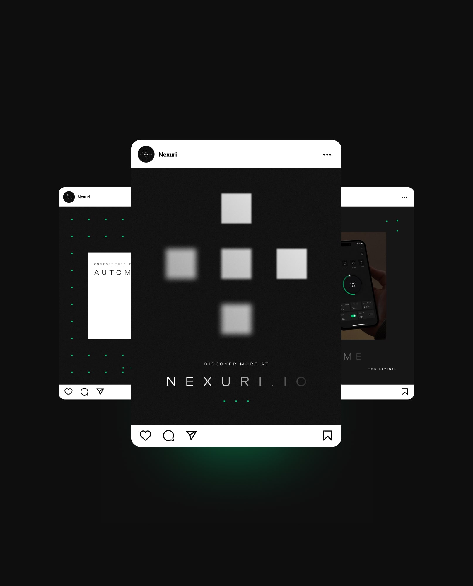
The visual style of Nexuri is a vibrant extension of our logo design, integrating the cube motif throughout the brand's identity. The iconset was crafted from individual cubes that can be easily combined or manipulated to reflect various features and services. This modular approach allows for dynamic representation, enabling instant association with Nexuri.
The visual style of Nexuri is a vibrant extension of our logo design, integrating the cube motif throughout the brand's identity. The iconset was crafted from individual cubes that can be easily combined or manipulated to reflect various features and services. This modular approach allows for dynamic representation, enabling instant association with Nexuri.
The visual style of Nexuri is a vibrant extension of our logo design, integrating the cube motif throughout the brand's identity. The iconset was crafted from individual cubes that can be easily combined or manipulated to reflect various features and services. This modular approach allows for dynamic representation, enabling instant association with Nexuri.
The visual style of Nexuri is a vibrant extension of our logo design, integrating the cube motif throughout the brand's identity. The iconset was crafted from individual cubes that can be easily combined or manipulated to reflect various features and services. This modular approach allows for dynamic representation, enabling instant association with Nexuri.
The visual style of Nexuri is a vibrant extension of our logo design, integrating the cube motif throughout the brand's identity. The iconset was crafted from individual cubes that can be easily combined or manipulated to reflect various features and services. This modular approach allows for dynamic representation, enabling instant association with Nexuri.
The visual style of Nexuri is a vibrant extension of our logo design, integrating the cube motif throughout the brand's identity. The iconset was crafted from individual cubes that can be easily combined or manipulated to reflect various features and services. This modular approach allows for dynamic representation, enabling instant association with Nexuri.
The visual style of Nexuri is a vibrant extension of our logo design, integrating the cube motif throughout the brand's identity. The iconset was crafted from individual cubes that can be easily combined or manipulated to reflect various features and services. This modular approach allows for dynamic representation, enabling instant association with Nexuri.





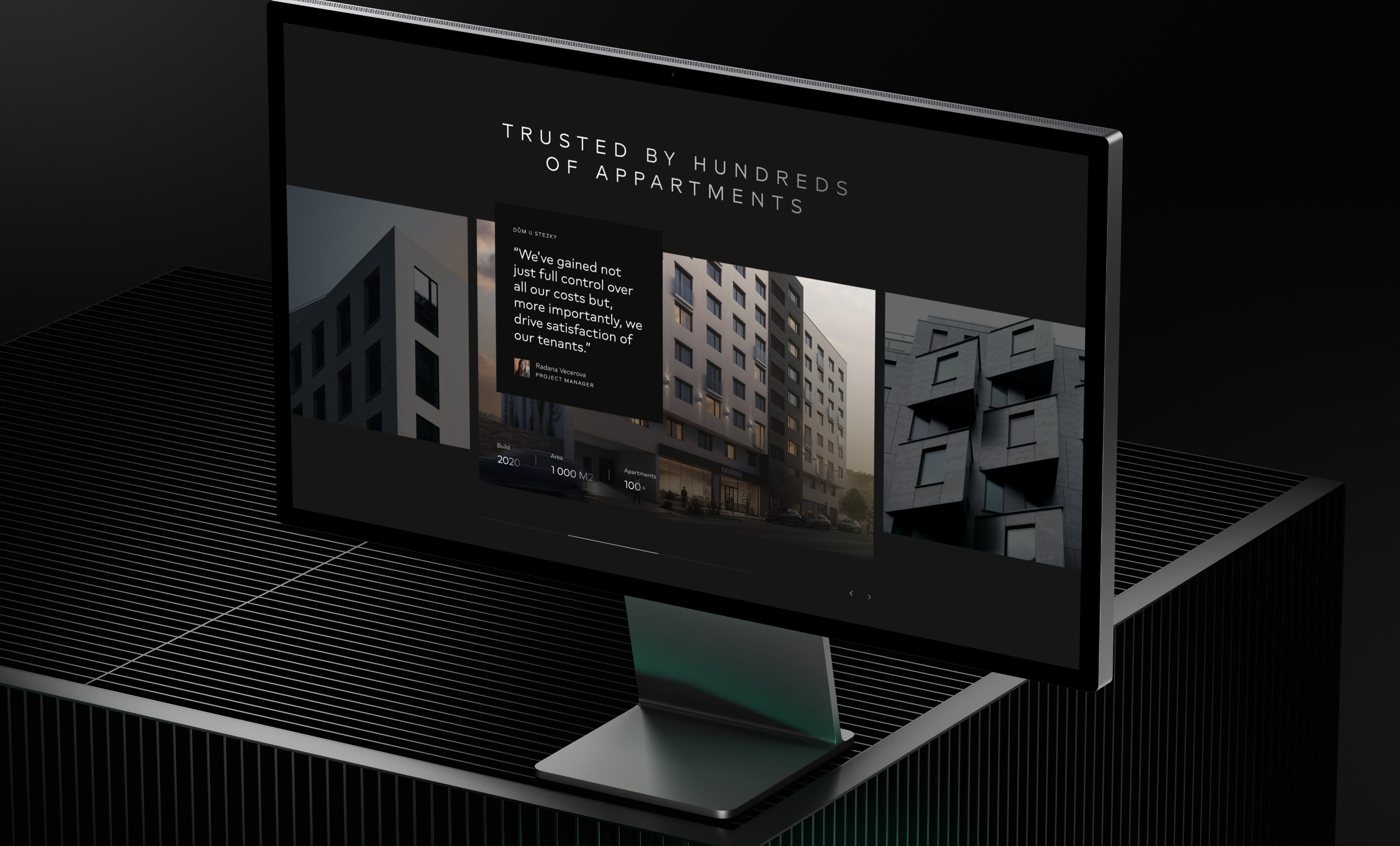


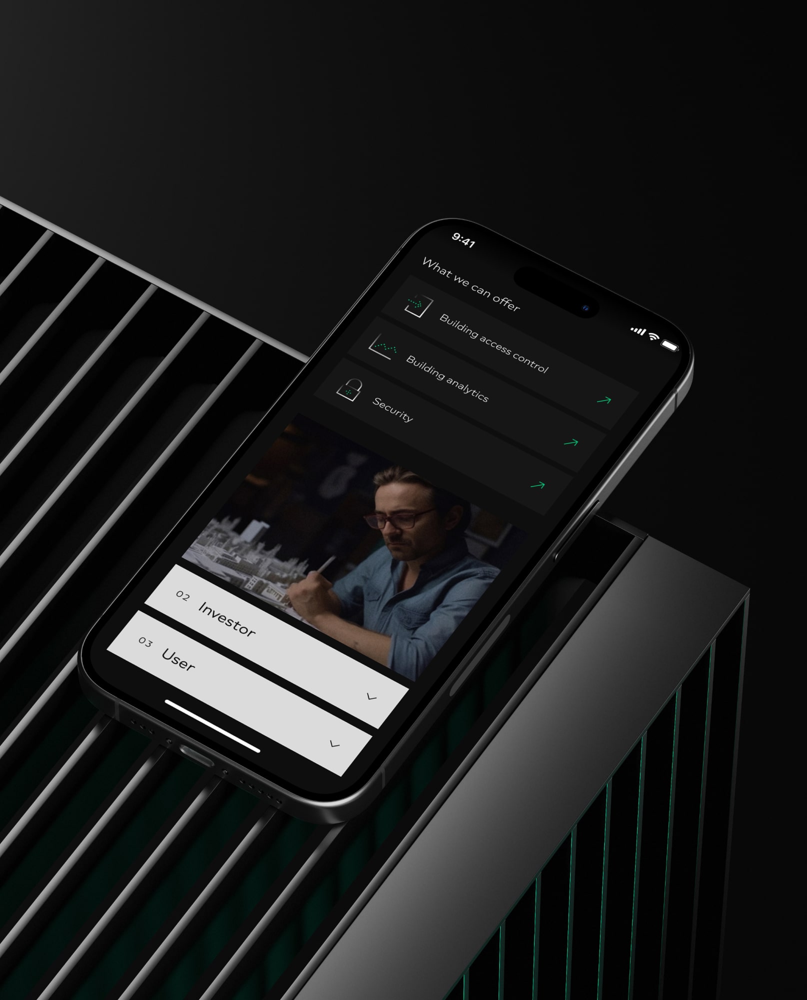
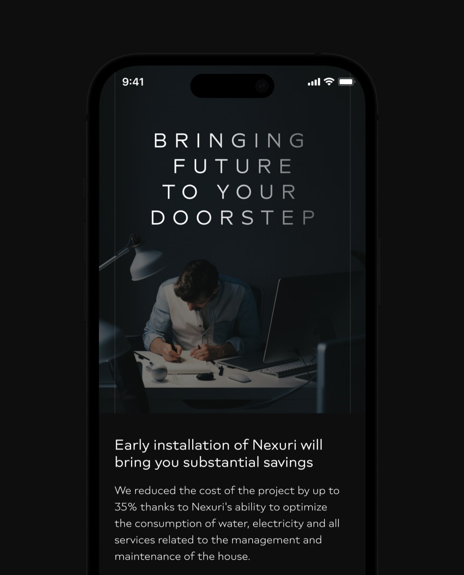
The website was designed to provide an engaging digital experience that truly resonates with users. The use of ample white space enhances readability while guiding visitors through a visually dynamic journey. Interactive elements such as hover effects and animated transitions invite exploration and create a sense of playfulness.
The website was designed to provide an engaging digital experience that truly resonates with users. The use of ample white space enhances readability while guiding visitors through a visually dynamic journey. Interactive elements such as hover effects and animated transitions invite exploration and create a sense of playfulness.
The website was designed to provide an engaging digital experience that truly resonates with users. The use of ample white space enhances readability while guiding visitors through a visually dynamic journey. Interactive elements such as hover effects and animated transitions invite exploration and create a sense of playfulness.
The website was designed to provide an engaging digital experience that truly resonates with users. The use of ample white space enhances readability while guiding visitors through a visually dynamic journey. Interactive elements such as hover effects and animated transitions invite exploration and create a sense of playfulness.
The website was designed to provide an engaging digital experience that truly resonates with users. The use of ample white space enhances readability while guiding visitors through a visually dynamic journey. Interactive elements such as hover effects and animated transitions invite exploration and create a sense of playfulness.
The website was designed to provide an engaging digital experience that truly resonates with users. The use of ample white space enhances readability while guiding visitors through a visually dynamic journey. Interactive elements such as hover effects and animated transitions invite exploration and create a sense of playfulness.
The website was designed to provide an engaging digital experience that truly resonates with users. The use of ample white space enhances readability while guiding visitors through a visually dynamic journey. Interactive elements such as hover effects and animated transitions invite exploration and create a sense of playfulness.






THE result
THE result
THE result
THE result
THE result
THE result
Increased energy savings & enhanced oversight
Increased energy savings & enhanced oversight
Increased energy savings & enhanced oversight
Increased energy savings & enhanced oversight
Increased energy savings & enhanced oversight
Increased energy savings & enhanced oversight
Increased energy savings & enhanced oversight
Increased energy savings & enhanced oversight
Nexuri’s identity has transformed the brand into a dynamic force in its industry. Users are experiencing enhanced engagement and trust, leading to increased adoption of the platform. Moreover, the implementation of energy consumption monitoring has resulted in tangible benefits, with owners and users saving in total more than 500 000 CZK yearly on energy costs.
Nexuri’s identity has transformed the brand into a dynamic force in its industry. Users are experiencing enhanced engagement and trust, leading to increased adoption of the platform. Moreover, the implementation of energy consumption monitoring has resulted in tangible benefits, with owners and users saving in total more than 500 000 CZK yearly on energy costs.
Nexuri’s identity has transformed the brand into a dynamic force in its industry. Users are experiencing enhanced engagement and trust, leading to increased adoption of the platform. Moreover, the implementation of energy consumption monitoring has resulted in tangible benefits, with owners and users saving in total more than 500 000 CZK yearly on energy costs.
Nexuri’s identity has transformed the brand into a dynamic force in its industry. Users are experiencing enhanced engagement and trust, leading to increased adoption of the platform. Moreover, the implementation of energy consumption monitoring has resulted in tangible benefits, with owners and users saving in total more than 500 000 CZK yearly on energy costs.
Nexuri’s identity has transformed the brand into a dynamic force in its industry. Users are experiencing enhanced engagement and trust, leading to increased adoption of the platform. Moreover, the implementation of energy consumption monitoring has resulted in tangible benefits, with owners and users saving in total more than 500 000 CZK yearly on energy costs.
Nexuri’s identity has transformed the brand into a dynamic force in its industry. Users are experiencing enhanced engagement and trust, leading to increased adoption of the platform. Moreover, the implementation of energy consumption monitoring has resulted in tangible benefits, with owners and users saving in total more than 500 000 CZK yearly on energy costs.
Nexuri’s identity has transformed the brand into a dynamic force in its industry. Users are experiencing enhanced engagement and trust, leading to increased adoption of the platform. Moreover, the implementation of energy consumption monitoring has resulted in tangible benefits, with owners and users saving in total more than 500 000 CZK yearly on energy costs.


500 000 +
500 000 +
500 000 +
500 000 +
500 000 +
CZK saved on energy costs
CZK saved on energy costs
CZK saved on energy costs
CZK saved on energy costs
CZK saved on energy costs
300 +
300 +
300 +
300 +
300 +
Residential units using the application
Residential units using the application
Residential units using the application
Residential units using the application
Residential units using the application
500 000 +
CZK saved on energy costs
300 +
Residential units using the application
500 000 +
CZK saved on energy costs
300 +
Residential units using the application
500 000 +
CZK saved on energy costs
300 +
Residential units using the application


