TRANSFORMING WORKPLACE
TRANSFORMING WORKPLACE
TRANSFORMING WORKPLACE WELL-BEING THROUGH DESIGN
TRANSFORMING WORKPLACE
TRANSFORMING WORKPLACE WELL-BEING THROUGH DESIGN
TRANSFORMING WORKPLACE
TRANSFORMING WORKPLACE
TRANSFORMING WORKPLACE WELL-BEING THROUGH DESIGN
WELL-BEING THROUGH DESIGN
WELL-BEING THROUGH DESIGN
WELL-BEING THROUGH DESIGN
WELL-BEING THROUGH DESIGN
WELL-BEING THROUGH DESIGN


PROJECT OVERVIEW
PROJECT OVERVIEW
PROJECT OVERVIEW
PROJECT OVERVIEW
PROJECT OVERVIEW
PROJECT OVERVIEW
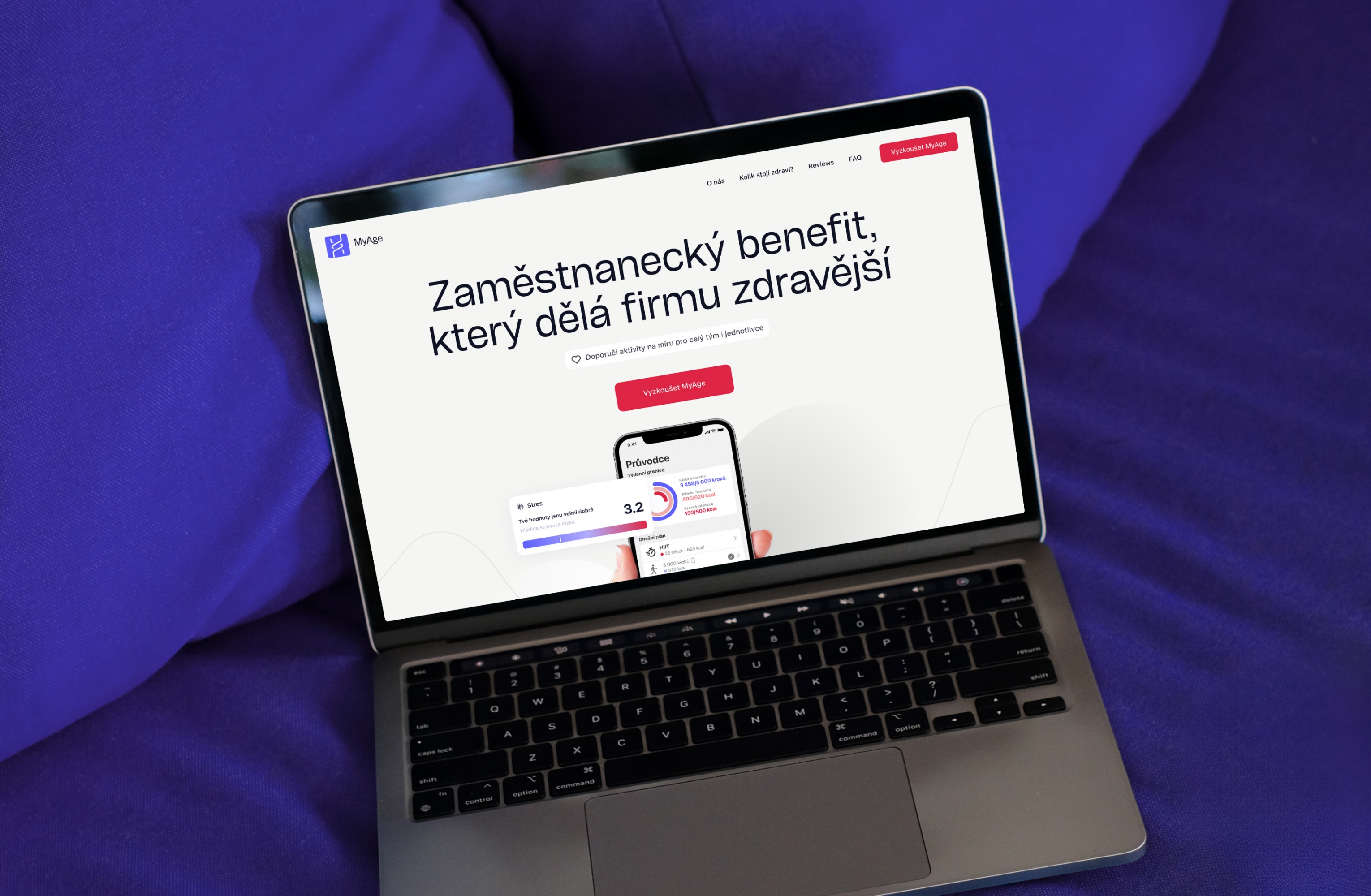
MyAge stands as a strategic partner for employers, offering a user-friendly software that not only prioritises employee well-being but also provides the tools and insights necessary for effective company management, such as measuring and optimising employees' functional age, stress levels, recovery, and energy values. The client approached us with a mission to build a landing page tailored to employers, promoting the product as a valuable employee benefit.
MyAge stands as a strategic partner for employers, offering a user-friendly software that not only prioritises employee well-being but also provides the tools and insights necessary for effective company management, such as measuring and optimising employees' functional age, stress levels, recovery, and energy values. The client approached us with a mission to build a landing page tailored to employers, promoting the product as a valuable employee benefit.
MyAge stands as a strategic partner for employers, offering a user-friendly software that not only prioritises employee well-being but also provides the tools and insights necessary for effective company management, such as measuring and optimising employees' functional age, stress levels, recovery, and energy values. The client approached us with a mission to build a landing page tailored to employers, promoting the product as a valuable employee benefit.
MyAge stands as a strategic partner for employers, offering a user-friendly software that not only prioritises employee well-being but also provides the tools and insights necessary for effective company management, such as measuring and optimising employees' functional age, stress levels, recovery, and energy values. The client approached us with a mission to build a landing page tailored to employers, promoting the product as a valuable employee benefit.
MyAge stands as a strategic partner for employers, offering a user-friendly software that not only prioritises employee well-being but also provides the tools and insights necessary for effective company management, such as measuring and optimising employees' functional age, stress levels, recovery, and energy values. The client approached us with a mission to build a landing page tailored to employers, promoting the product as a valuable employee benefit.
MyAge stands as a strategic partner for employers, offering a user-friendly software that not only prioritises employee well-being but also provides the tools and insights necessary for effective company management, such as measuring and optimising employees' functional age, stress levels, recovery, and energy values. The client approached us with a mission to build a landing page tailored to employers, promoting the product as a valuable employee benefit.
MyAge stands as a strategic partner for employers, offering a user-friendly software that not only prioritises employee well-being but also provides the tools and insights necessary for effective company management, such as measuring and optimising employees' functional age, stress levels, recovery, and energy values. The client approached us with a mission to build a landing page tailored to employers, promoting the product as a valuable employee benefit.


CLIENT
CLIENT
CLIENT
CLIENT
mySASY
mySASY
mySASY
mySASY
mySASY
CLIENT focus
CLIENT focus
CLIENT focus
CLIENT focus
Corporate wellness
Corporate wellness
Corporate wellness
Corporate wellness
Corporate wellness
type of work
type of work
type of work
type of work
Content Strategy
Content Strategy
Content Strategy
Content Strategy
Content Strategy
Web Design
Web Design
Web Design
Web Design
Web Design
country & year
country & year
country & year
country & year
Czechia, 2022
Czechia, 2022
Czechia, 2022
Czechia, 2022
Czechia, 2022
CLIENT
mySASY
CLIENT focus
Corporate wellness
type of work
Content Strategy
Web Design
country & year
Czechia, 2022
CLIENT
mySASY
CLIENT focus
Corporate wellness
type of work
Content Strategy
Web Design
country & year
Czechia, 2022
CLIENT
mySASY
CLIENT focus
Corporate wellness
type of work
Content Strategy
Web Design
country & year
Czechia, 2022
THE CHALLENGE
THE CHALLENGE
THE CHALLENGE
THE CHALLENGE
THE CHALLENGE
THE CHALLENGE
Reaping the benefits from promoting long-term health
Reaping the benefits from promoting long-term health
Reaping the benefits from promoting long-term health
Reaping the benefits from promoting long-term health
Reaping the benefits from promoting long-term health
Reaping the benefits from promoting long-term health
Reaping the benefits from promoting long-term health
Reaping the benefits from promoting long-term health
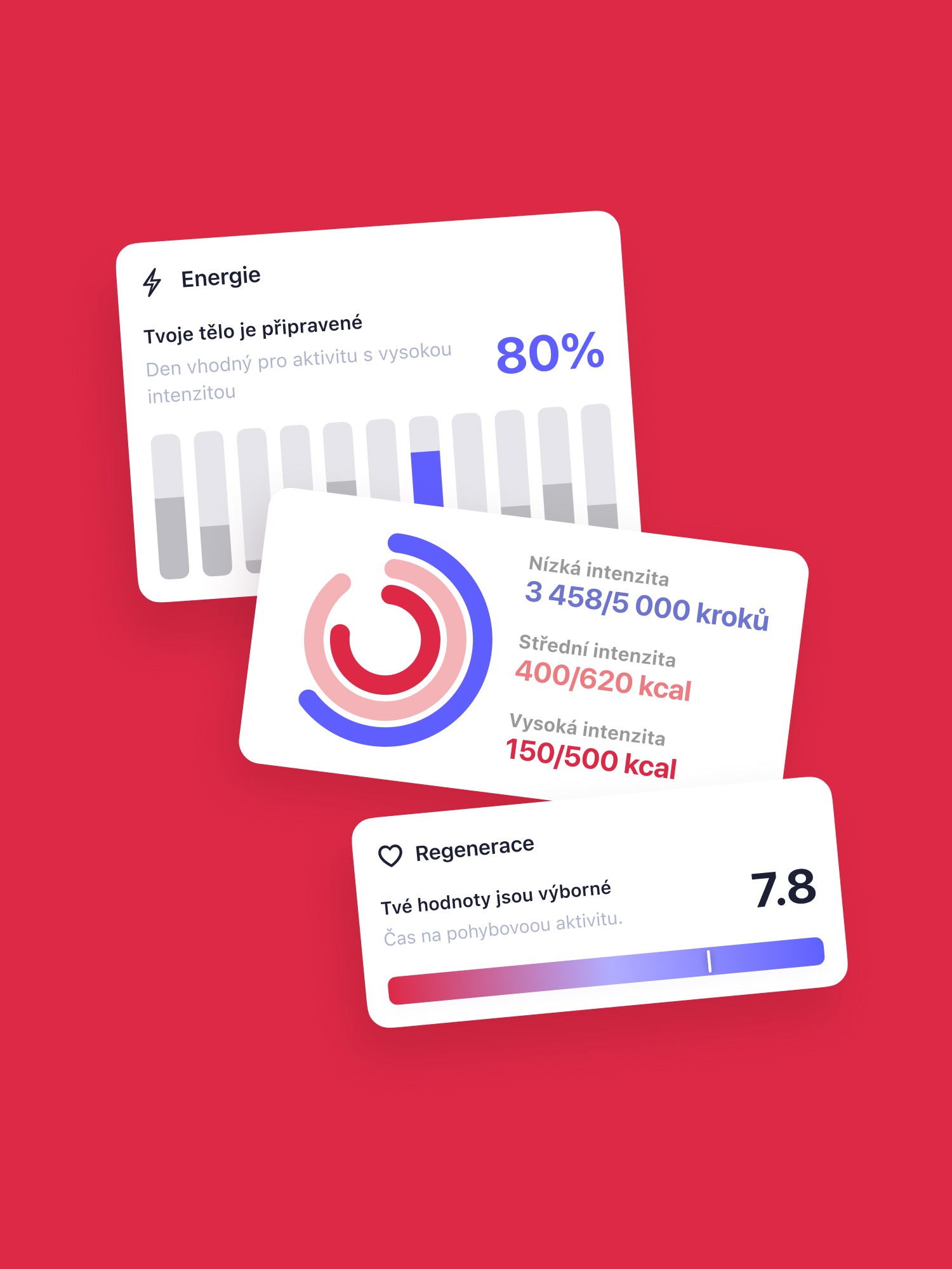
The challenge was mostly to communicate the health and financial benefits the product brings employers and their workforce. We are fans on unobtrusive copywriting, therefore we focused on powerful visualisations instead to truly showcase the value the product offers. How personalized plans lead to continual effectiveness and long-term health benefits.
The challenge was mostly to communicate the health and financial benefits the product brings employers and their workforce. We are fans on unobtrusive copywriting, therefore we focused on powerful visualisations instead to truly showcase the value the product offers. How personalized plans lead to continual effectiveness and long-term health benefits.
The challenge was mostly to communicate the health and financial benefits the product brings employers and their workforce. We are fans on unobtrusive copywriting, therefore we focused on powerful visualisations instead to truly showcase the value the product offers. How personalized plans lead to continual effectiveness and long-term health benefits.
The challenge was mostly to communicate the health and financial benefits the product brings employers and their workforce. We are fans on unobtrusive copywriting, therefore we focused on powerful visualisations instead to truly showcase the value the product offers. How personalized plans lead to continual effectiveness and long-term health benefits.
The challenge was mostly to communicate the health and financial benefits the product brings employers and their workforce. We are fans on unobtrusive copywriting, therefore we focused on powerful visualisations instead to truly showcase the value the product offers. How personalized plans lead to continual effectiveness and long-term health benefits.
The challenge was mostly to communicate the health and financial benefits the product brings employers and their workforce. We are fans on unobtrusive copywriting, therefore we focused on powerful visualisations instead to truly showcase the value the product offers. How personalized plans lead to continual effectiveness and long-term health benefits.
The challenge was mostly to communicate the health and financial benefits the product brings employers and their workforce. We are fans on unobtrusive copywriting, therefore we focused on powerful visualisations instead to truly showcase the value the product offers. How personalized plans lead to continual effectiveness and long-term health benefits.




the solution
the solution
the solution
the solution
the solution
the solution
Less words, more action (and numbers)
Less words, more action (and numbers)
Less words, more action (and numbers)
Less words, more action (and numbers)
Less words, more action (and numbers)
Less words, more action (and numbers)
Less words, more action (and numbers)
Less words, more action (and numbers)
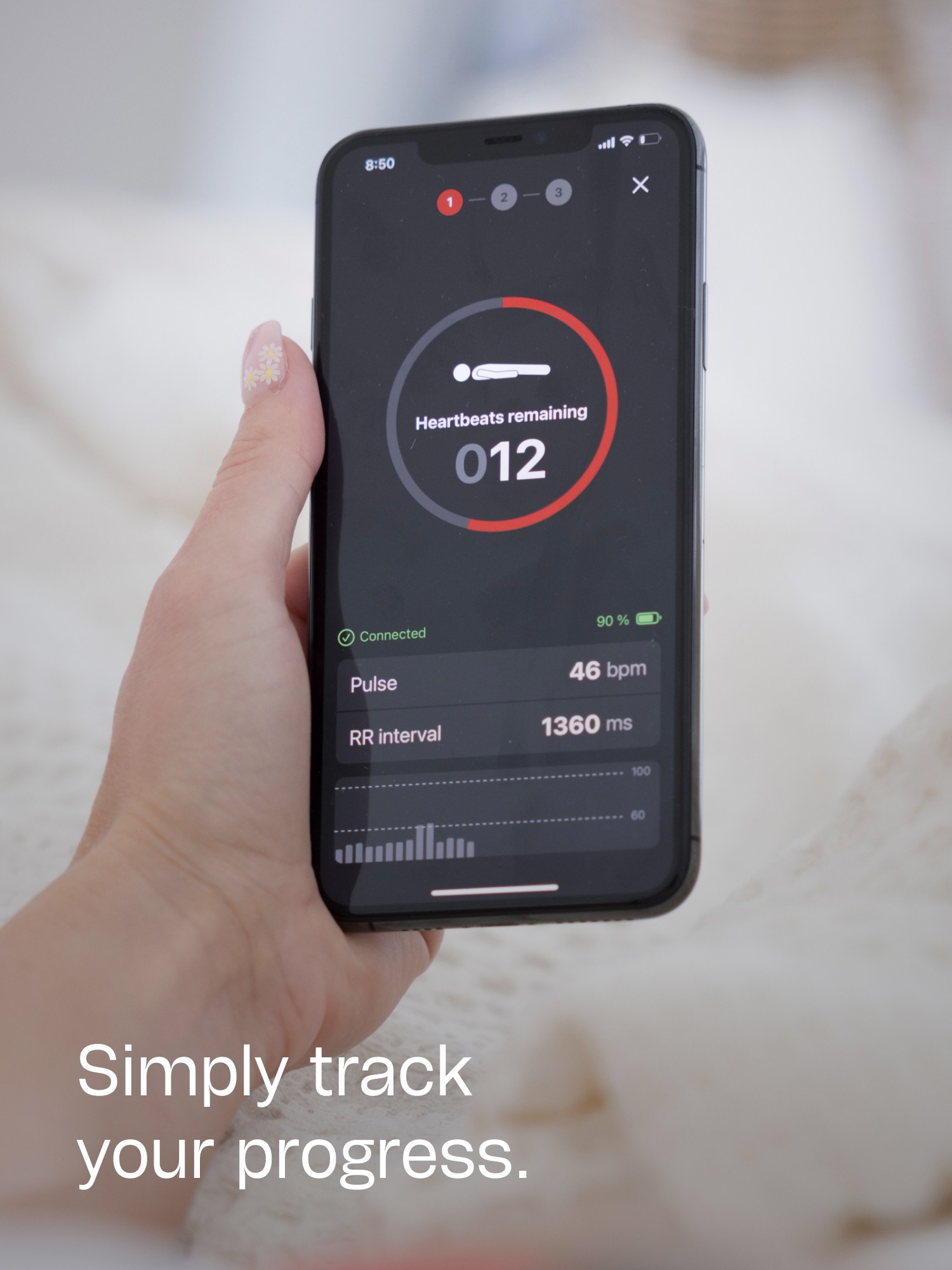
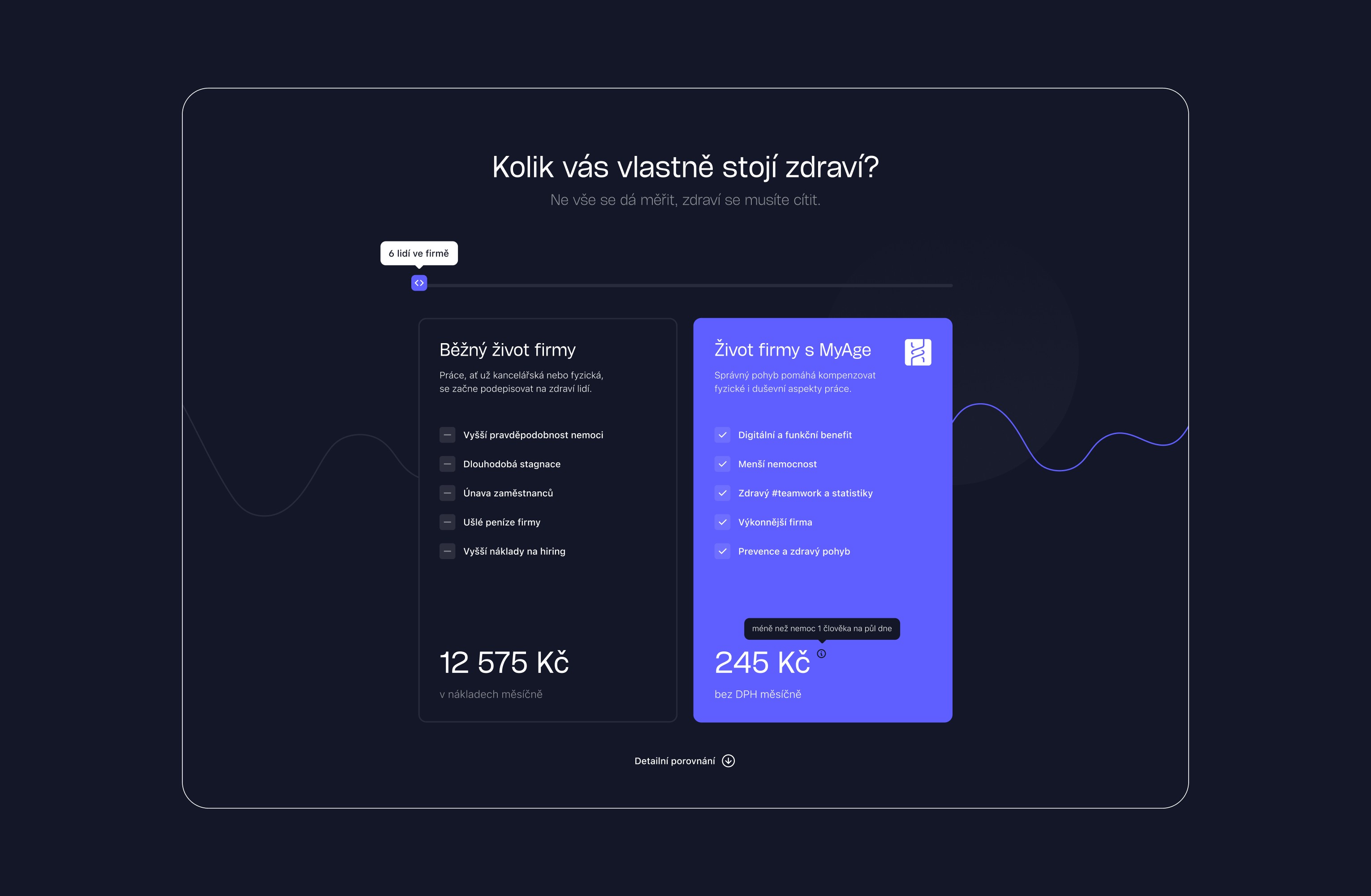
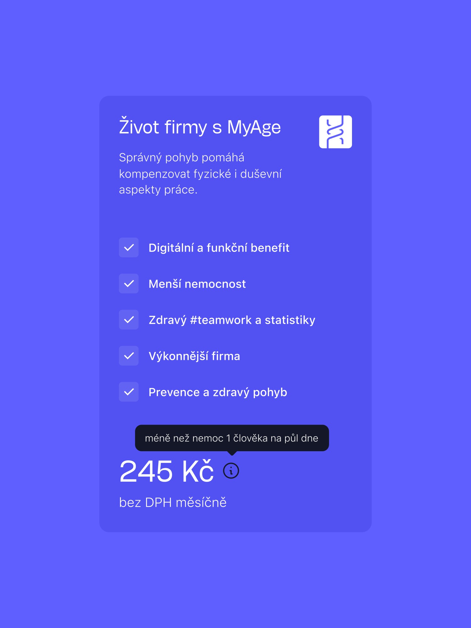
Our strategy centered around showcasing the app's impact on the bottom line - demonstrating how investing in employee well-being translates directly to cost savings for employers. And me made sure the website illustrates this properly by developing a dynamic cost savings calculator.
Our strategy centered around showcasing the app's impact on the bottom line - demonstrating how investing in employee well-being translates directly to cost savings for employers. And me made sure the website illustrates this properly by developing a dynamic cost savings calculator.
Our strategy centered around showcasing the app's impact on the bottom line - demonstrating how investing in employee well-being translates directly to cost savings for employers. And me made sure the website illustrates this properly by developing a dynamic cost savings calculator.
Our strategy centered around showcasing the app's impact on the bottom line - demonstrating how investing in employee well-being translates directly to cost savings for employers. And me made sure the website illustrates this properly by developing a dynamic cost savings calculator.
Our strategy centered around showcasing the app's impact on the bottom line - demonstrating how investing in employee well-being translates directly to cost savings for employers. And me made sure the website illustrates this properly by developing a dynamic cost savings calculator.
Our strategy centered around showcasing the app's impact on the bottom line - demonstrating how investing in employee well-being translates directly to cost savings for employers. And me made sure the website illustrates this properly by developing a dynamic cost savings calculator.
Our strategy centered around showcasing the app's impact on the bottom line - demonstrating how investing in employee well-being translates directly to cost savings for employers. And me made sure the website illustrates this properly by developing a dynamic cost savings calculator.






Clear path forward
Clear path forward
Clear path forward
Clear path forward
Clear path forward
Clear path forward
Clear path forward
Clear path forward
We crafted a clear pathway for users, outlining a step-by-step integration process. This ensured a hassle-free onboarding experience, allowing employers to seamlessly incorporate MyAge into their workspace.
We crafted a clear pathway for users, outlining a step-by-step integration process. This ensured a hassle-free onboarding experience, allowing employers to seamlessly incorporate MyAge into their workspace.
We crafted a clear pathway for users, outlining a step-by-step integration process. This ensured a hassle-free onboarding experience, allowing employers to seamlessly incorporate MyAge into their workspace.
We crafted a clear pathway for users, outlining a step-by-step integration process. This ensured a hassle-free onboarding experience, allowing employers to seamlessly incorporate MyAge into their workspace.
We crafted a clear pathway for users, outlining a step-by-step integration process. This ensured a hassle-free onboarding experience, allowing employers to seamlessly incorporate MyAge into their workspace.
We crafted a clear pathway for users, outlining a step-by-step integration process. This ensured a hassle-free onboarding experience, allowing employers to seamlessly incorporate MyAge into their workspace.
We crafted a clear pathway for users, outlining a step-by-step integration process. This ensured a hassle-free onboarding experience, allowing employers to seamlessly incorporate MyAge into their workspace.
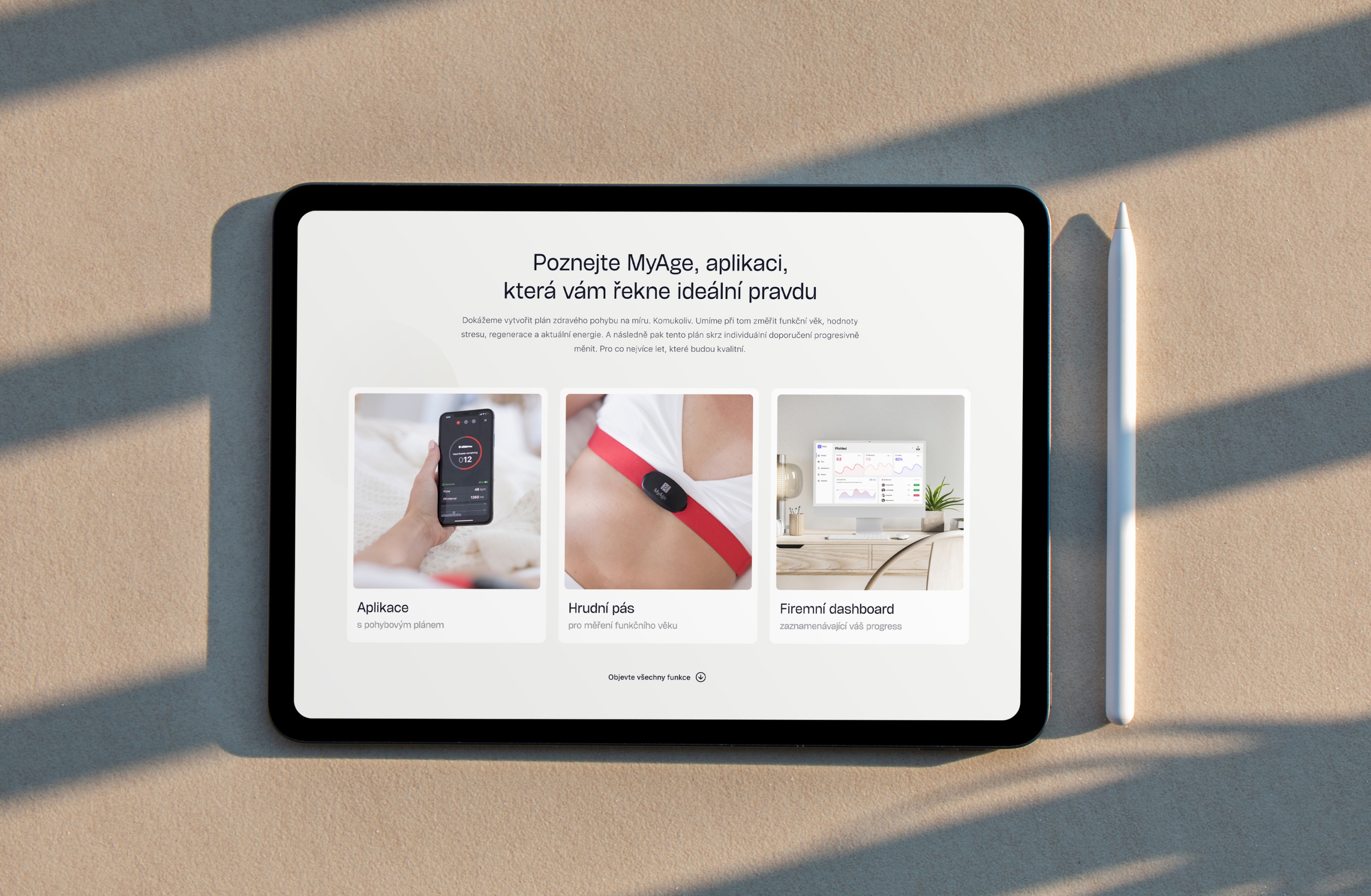


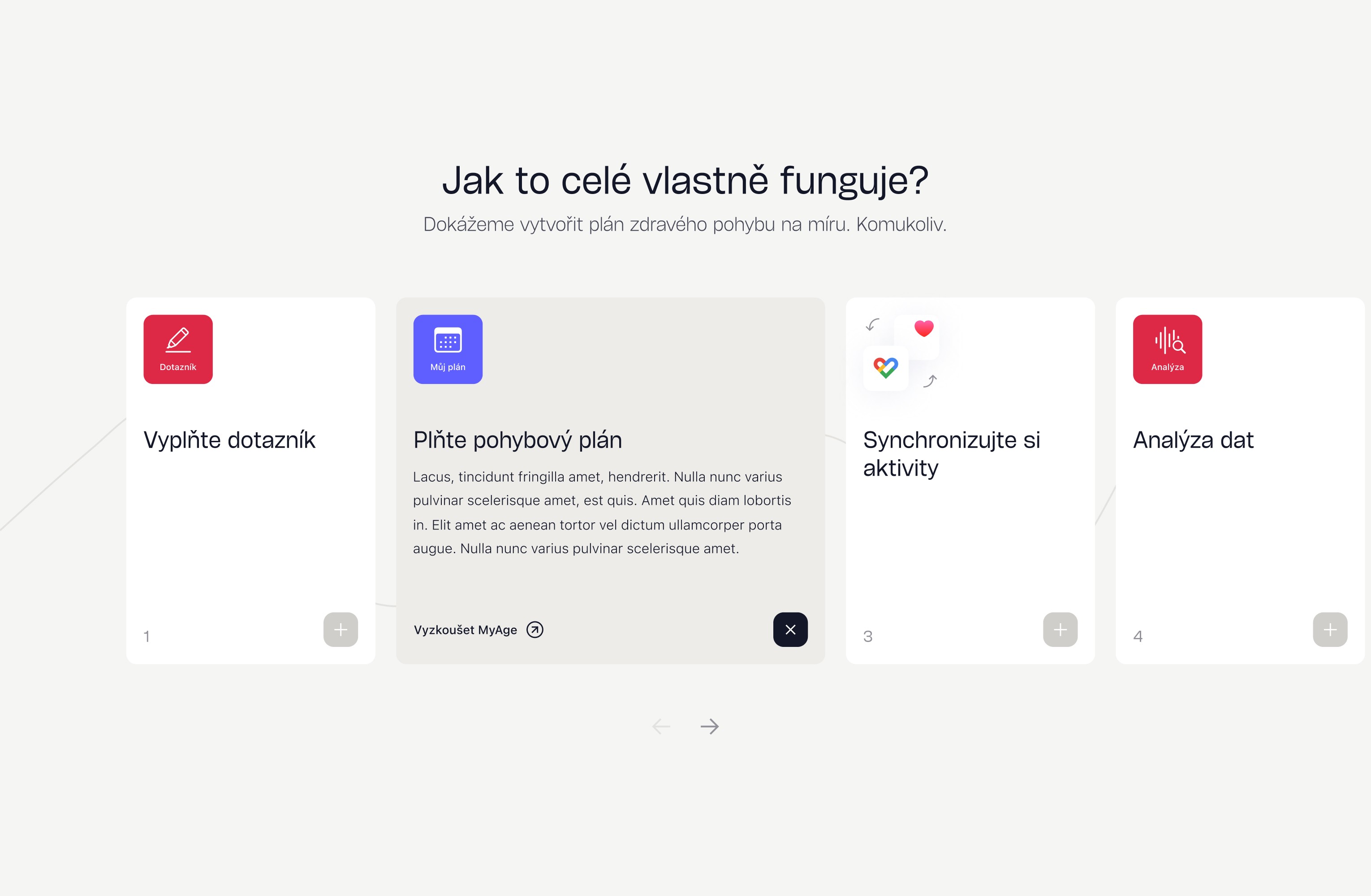


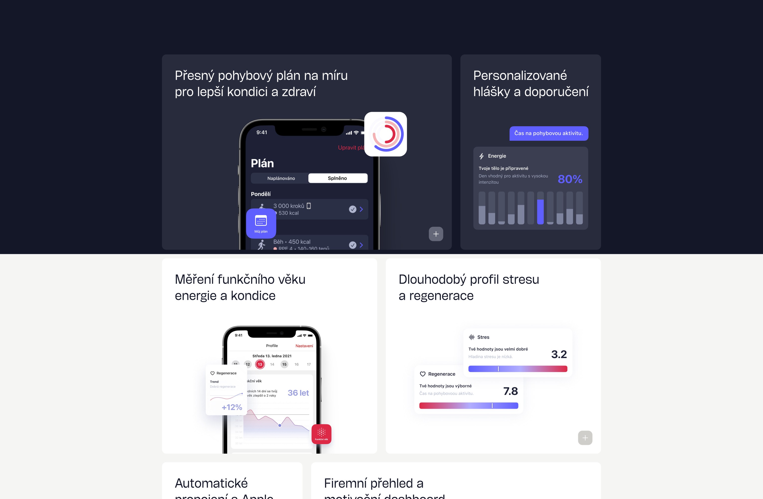
The landing page was designed using the MyAge’s brand style guide but the site was enriched with several motion effects. Yet the emphasis was primarily put on simplicity and clarity so the visuals and copy deliver the important information.
The landing page was designed using the MyAge’s brand style guide but the site was enriched with several motion effects. Yet the emphasis was primarily put on simplicity and clarity so the visuals and copy deliver the important information.
The landing page was designed using the MyAge’s brand style guide but the site was enriched with several motion effects. Yet the emphasis was primarily put on simplicity and clarity so the visuals and copy deliver the important information.
The landing page was designed using the MyAge’s brand style guide but the site was enriched with several motion effects. Yet the emphasis was primarily put on simplicity and clarity so the visuals and copy deliver the important information.
The landing page was designed using the MyAge’s brand style guide but the site was enriched with several motion effects. Yet the emphasis was primarily put on simplicity and clarity so the visuals and copy deliver the important information.
The landing page was designed using the MyAge’s brand style guide but the site was enriched with several motion effects. Yet the emphasis was primarily put on simplicity and clarity so the visuals and copy deliver the important information.
The landing page was designed using the MyAge’s brand style guide but the site was enriched with several motion effects. Yet the emphasis was primarily put on simplicity and clarity so the visuals and copy deliver the important information.






Demonstrating value through real-life experiences
Demonstrating value through real-life experiences
Demonstrating value through real-life experiences
Demonstrating value through real-life experiences
Demonstrating value through real-life experiences
Demonstrating value through real-life experiences
Demonstrating value through real-life experiences
Demonstrating value through real-life experiences
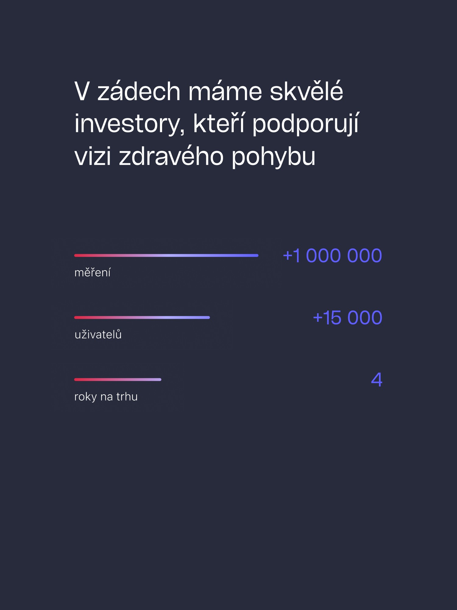
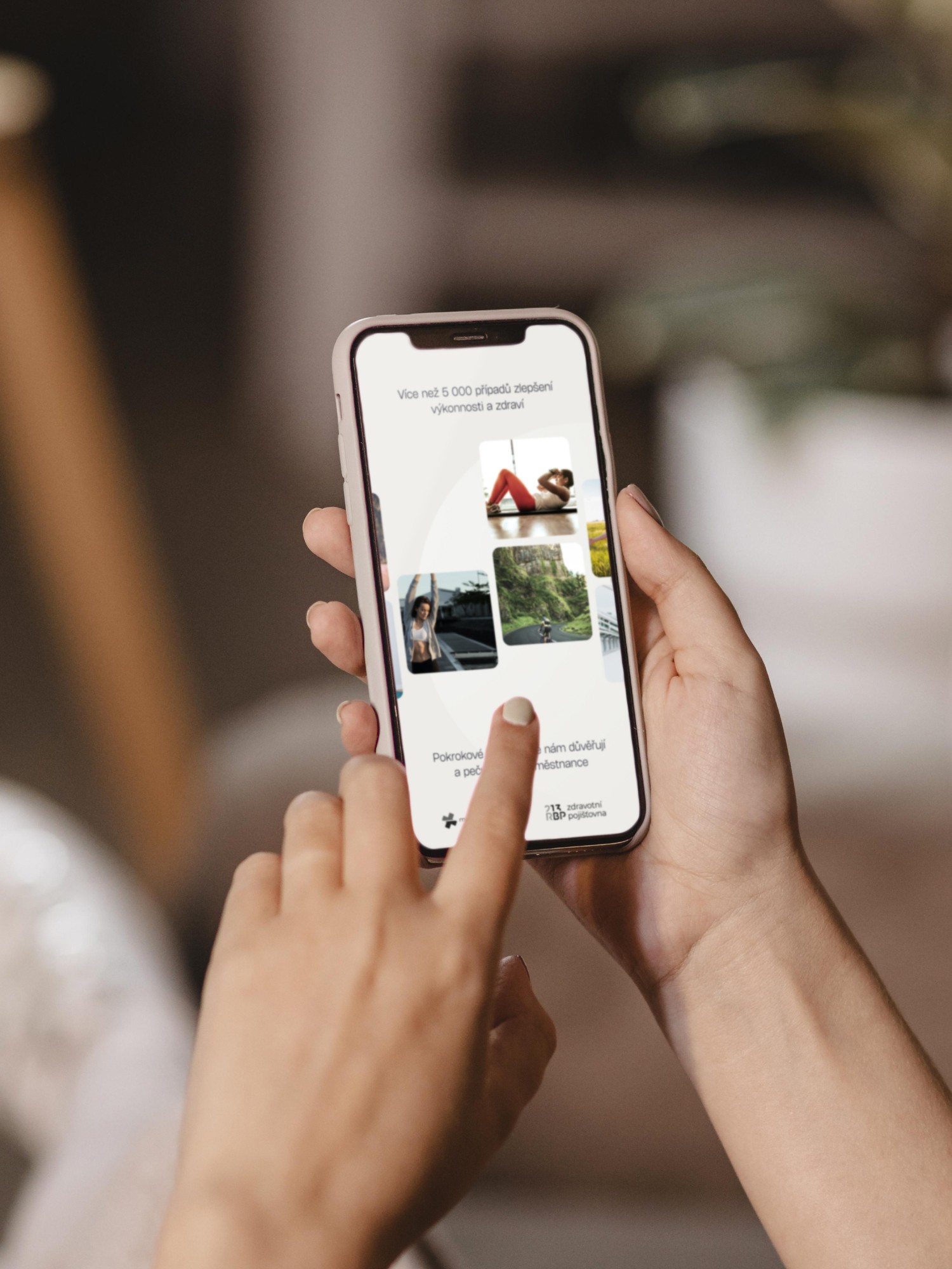
Building credibility and trust in the product was something we aimed for when thinking about the content and copywriting. Mentioning the positive results the product had on big companies was desirable.
Building credibility and trust in the product was something we aimed for when thinking about the content and copywriting. Mentioning the positive results the product had on big companies was desirable.
Building credibility and trust in the product was something we aimed for when thinking about the content and copywriting. Mentioning the positive results the product had on big companies was desirable.
Building credibility and trust in the product was something we aimed for when thinking about the content and copywriting. Mentioning the positive results the product had on big companies was desirable.
Building credibility and trust in the product was something we aimed for when thinking about the content and copywriting. Mentioning the positive results the product had on big companies was desirable.
Building credibility and trust in the product was something we aimed for when thinking about the content and copywriting. Mentioning the positive results the product had on big companies was desirable.
Building credibility and trust in the product was something we aimed for when thinking about the content and copywriting. Mentioning the positive results the product had on big companies was desirable.




THE result
THE result
THE result
THE result
THE result
THE result
Visually smooth experience & clear integration process
Visually smooth experience & clear integration process
Visually smooth experience & clear integration process
Visually smooth experience & clear integration process
Visually smooth experience & clear integration process
Visually smooth experience & clear integration process
Visually smooth experience & clear integration process
Visually smooth experience & clear integration process
The landing page was designed to offer a seamless journey, ensuring every interaction was not only intuitive but also visually appealing. We streamlined the integration process, providing a clear step-by-step guide which resulted in an aesthetically pleasing and effortlessly functional experience.
The landing page was designed to offer a seamless journey, ensuring every interaction was not only intuitive but also visually appealing. We streamlined the integration process, providing a clear step-by-step guide which resulted in an aesthetically pleasing and effortlessly functional experience.
The landing page was designed to offer a seamless journey, ensuring every interaction was not only intuitive but also visually appealing. We streamlined the integration process, providing a clear step-by-step guide which resulted in an aesthetically pleasing and effortlessly functional experience.
The landing page was designed to offer a seamless journey, ensuring every interaction was not only intuitive but also visually appealing. We streamlined the integration process, providing a clear step-by-step guide which resulted in an aesthetically pleasing and effortlessly functional experience.
The website Brazen® created for me exceeded my expectations in every way. It's beautiful, functional, and exactly what I was looking for. I couldn't be happier with the results.
The website Brazen® created for me exceeded my expectations in every way. It's beautiful, functional, and exactly what I was looking for. I couldn't be happier with the results.
The website Brazen® created for me exceeded my expectations in every way. It's beautiful, functional, and exactly what I was looking for. I couldn't be happier with the results.


Benjamin Anderson
Benjamin Anderson
Benjamin Anderson
FOUNDER & CEO
FOUNDER & CEO
FOUNDER & CEO
Clutch review
