IMMERSING USERS INTO
IMMERSING USERS INTO
IMMERSING USERS INTO
THE RICH BEAUTY OF SLOVAK NATURE
IMMERSING USERS INTO
IMMERSING USERS INTO
IMMERSING USERS INTO
IMMERSING USERS INTO
THE RICH BEAUTY OF SLOVAK NATURE
IMMERSING USERS INTO THE RICH BEAUTY OF SLOVAK NATURE
THE RICH BEAUTY OF SLOVAK NATURE
THE RICH BEAUTY OF SLOVAK NATURE
THE RICH BEAUTY OF SLOVAK NATURE
THE RICH BEAUTY OF SLOVAK NATURE
THE RICH BEAUTY OF SLOVAK NATURE


PROJECT OVERVIEW
PROJECT OVERVIEW
PROJECT OVERVIEW
PROJECT OVERVIEW
PROJECT OVERVIEW
PROJECT OVERVIEW
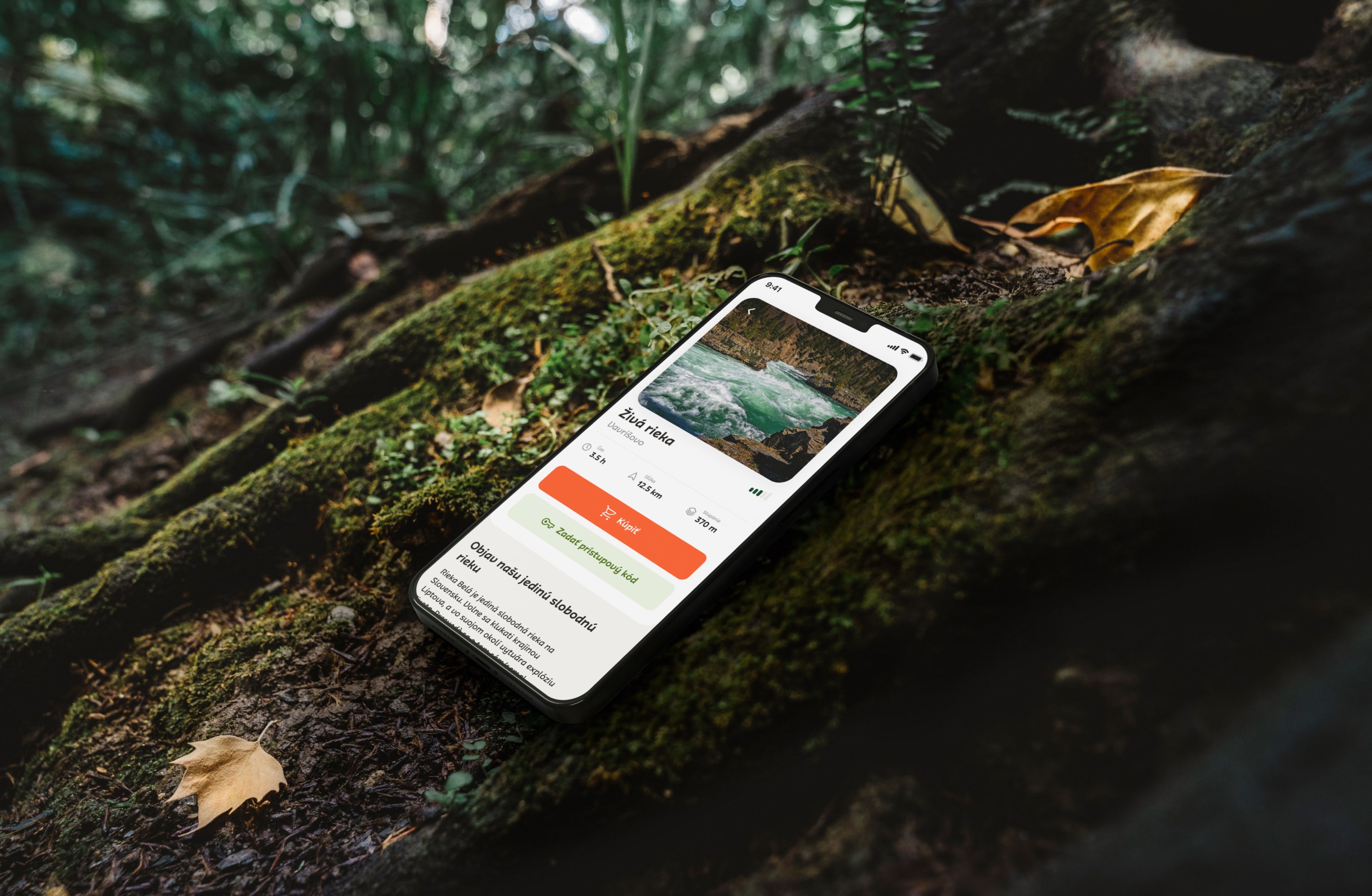
Lesmír is a mobile application developed to connect users with Slovak nature by providing them with a trail-guide experience. We embarked on a journey of exploration with Lesmír. We were tasked with revamping its UI and enhancing UX flows across the entire application to facilitate seamless interaction and discovery of Slovakia's hidden gems.
Lesmír is a mobile application developed to connect users with Slovak nature by providing them with a trail-guide experience. We embarked on a journey of exploration with Lesmír. We were tasked with revamping its UI and enhancing UX flows across the entire application to facilitate seamless interaction and discovery of Slovakia's hidden gems.
Lesmír is a mobile application developed to connect users with Slovak nature by providing them with a trail-guide experience. We embarked on a journey of exploration with Lesmír. We were tasked with revamping its UI and enhancing UX flows across the entire application to facilitate seamless interaction and discovery of Slovakia's hidden gems.
Lesmír is a mobile application developed to connect users with Slovak nature by providing them with a trail-guide experience. We embarked on a journey of exploration with Lesmír. We were tasked with revamping its UI and enhancing UX flows across the entire application to facilitate seamless interaction and discovery of Slovakia's hidden gems.
Lesmír is a mobile application developed to connect users with Slovak nature by providing them with a trail-guide experience. We embarked on a journey of exploration with Lesmír. We were tasked with revamping its UI and enhancing UX flows across the entire application to facilitate seamless interaction and discovery of Slovakia's hidden gems.
Lesmír is a mobile application developed to connect users with Slovak nature by providing them with a trail-guide experience. We embarked on a journey of exploration with Lesmír. We were tasked with revamping its UI and enhancing UX flows across the entire application to facilitate seamless interaction and discovery of Slovakia's hidden gems.
Lesmír is a mobile application developed to connect users with Slovak nature by providing them with a trail-guide experience. We embarked on a journey of exploration with Lesmír. We were tasked with revamping its UI and enhancing UX flows across the entire application to facilitate seamless interaction and discovery of Slovakia's hidden gems.


CLIENT
CLIENT
CLIENT
CLIENT
Lesmír (Created for Krásnô Štúdio)
Lesmír (Created for Krásnô Štúdio)
Lesmír (Created for Krásnô Štúdio)
Lesmír (Created for Krásnô Štúdio)
Lesmír (Created for Krásnô Štúdio)
CLIENT focus
CLIENT focus
CLIENT focus
CLIENT focus
Trail guide
Trail guide
Trail guide
Trail guide
Trail guide
type of work
type of work
type of work
type of work
UX/UI Design
UX/UI Design
UX/UI Design
UX/UI Design
UX/UI Design
Web Design
Web Design
Web Design
Web Design
Web Design
country & year
country & year
country & year
country & year
Slovakia, 2022–2023
Slovakia, 2022–2023
Slovakia, 2022–2023
Slovakia, 2022–2023
Slovakia, 2022–2023
CLIENT
Lesmír (Created for Krásnô Štúdio)
CLIENT focus
Trail guide
type of work
UX/UI Design
Web Design
country & year
Slovakia, 2022–2023
CLIENT
Lesmír (Created for Krásnô Štúdio)
CLIENT focus
Trail guide
type of work
UX/UI Design
Web Design
country & year
Slovakia, 2022–2023
CLIENT
Lesmír (Created for Krásnô Štúdio)
CLIENT focus
Trail guide
type of work
UX/UI Design
Web Design
country & year
Slovakia, 2022–2023
THE CHALLENGE
THE CHALLENGE
THE CHALLENGE
THE CHALLENGE
THE CHALLENGE
THE CHALLENGE
Reliability over everything
Reliability over everything
Reliability over everything
Reliability over everything
Reliability over everything
Reliability over everything
Reliability over everything
Reliability over everything
The primary challenge was to prioritise reliability, ensuring users could depend on the app for every aspect of their journey without encountering unexpected obstacles. The previous design suffered from confusing user flows, creating a maze of interactions that left users unsure of their journey within the app. Critical states were missing, leaving users uninformed about their actions and the app's responses, leading to potential frustration, disorientation and potential abandonment. The visual style was outdated, contributing to a lack of aesthetic appeal and potentially deterring users from engaging with the app.
The primary challenge was to prioritise reliability, ensuring users could depend on the app for every aspect of their journey without encountering unexpected obstacles. The previous design suffered from confusing user flows, creating a maze of interactions that left users unsure of their journey within the app. Critical states were missing, leaving users uninformed about their actions and the app's responses, leading to potential frustration, disorientation and potential abandonment. The visual style was outdated, contributing to a lack of aesthetic appeal and potentially deterring users from engaging with the app.
The primary challenge was to prioritise reliability, ensuring users could depend on the app for every aspect of their journey without encountering unexpected obstacles. The previous design suffered from confusing user flows, creating a maze of interactions that left users unsure of their journey within the app. Critical states were missing, leaving users uninformed about their actions and the app's responses, leading to potential frustration, disorientation and potential abandonment. The visual style was outdated, contributing to a lack of aesthetic appeal and potentially deterring users from engaging with the app.
The primary challenge was to prioritise reliability, ensuring users could depend on the app for every aspect of their journey without encountering unexpected obstacles. The previous design suffered from confusing user flows, creating a maze of interactions that left users unsure of their journey within the app. Critical states were missing, leaving users uninformed about their actions and the app's responses, leading to potential frustration, disorientation and potential abandonment. The visual style was outdated, contributing to a lack of aesthetic appeal and potentially deterring users from engaging with the app.
The primary challenge was to prioritise reliability, ensuring users could depend on the app for every aspect of their journey without encountering unexpected obstacles. The previous design suffered from confusing user flows, creating a maze of interactions that left users unsure of their journey within the app. Critical states were missing, leaving users uninformed about their actions and the app's responses, leading to potential frustration, disorientation and potential abandonment. The visual style was outdated, contributing to a lack of aesthetic appeal and potentially deterring users from engaging with the app.
The primary challenge was to prioritise reliability, ensuring users could depend on the app for every aspect of their journey without encountering unexpected obstacles. The previous design suffered from confusing user flows, creating a maze of interactions that left users unsure of their journey within the app. Critical states were missing, leaving users uninformed about their actions and the app's responses, leading to potential frustration, disorientation and potential abandonment. The visual style was outdated, contributing to a lack of aesthetic appeal and potentially deterring users from engaging with the app.
The primary challenge was to prioritise reliability, ensuring users could depend on the app for every aspect of their journey without encountering unexpected obstacles. The previous design suffered from confusing user flows, creating a maze of interactions that left users unsure of their journey within the app. Critical states were missing, leaving users uninformed about their actions and the app's responses, leading to potential frustration, disorientation and potential abandonment. The visual style was outdated, contributing to a lack of aesthetic appeal and potentially deterring users from engaging with the app.






the solution
the solution
the solution
the solution
the solution
the solution
Balancing playfulness & modern elegance
Balancing playfulness & modern elegance
Balancing playfulness & modern elegance
Balancing playfulness & modern elegance
Balancing playfulness & modern elegance
Balancing playfulness & modern elegance
Balancing playfulness & modern elegance
Balancing playfulness & modern elegance
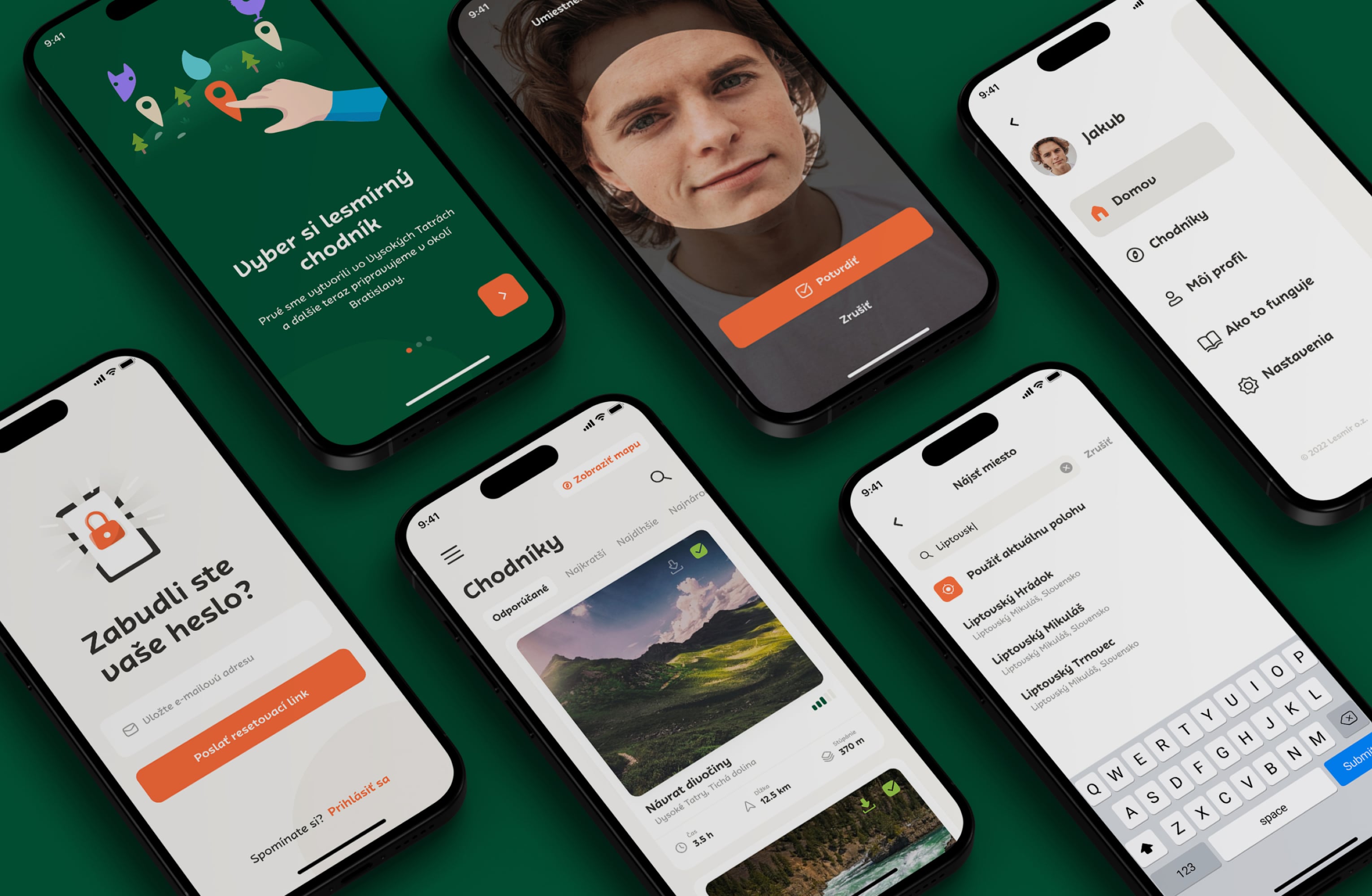
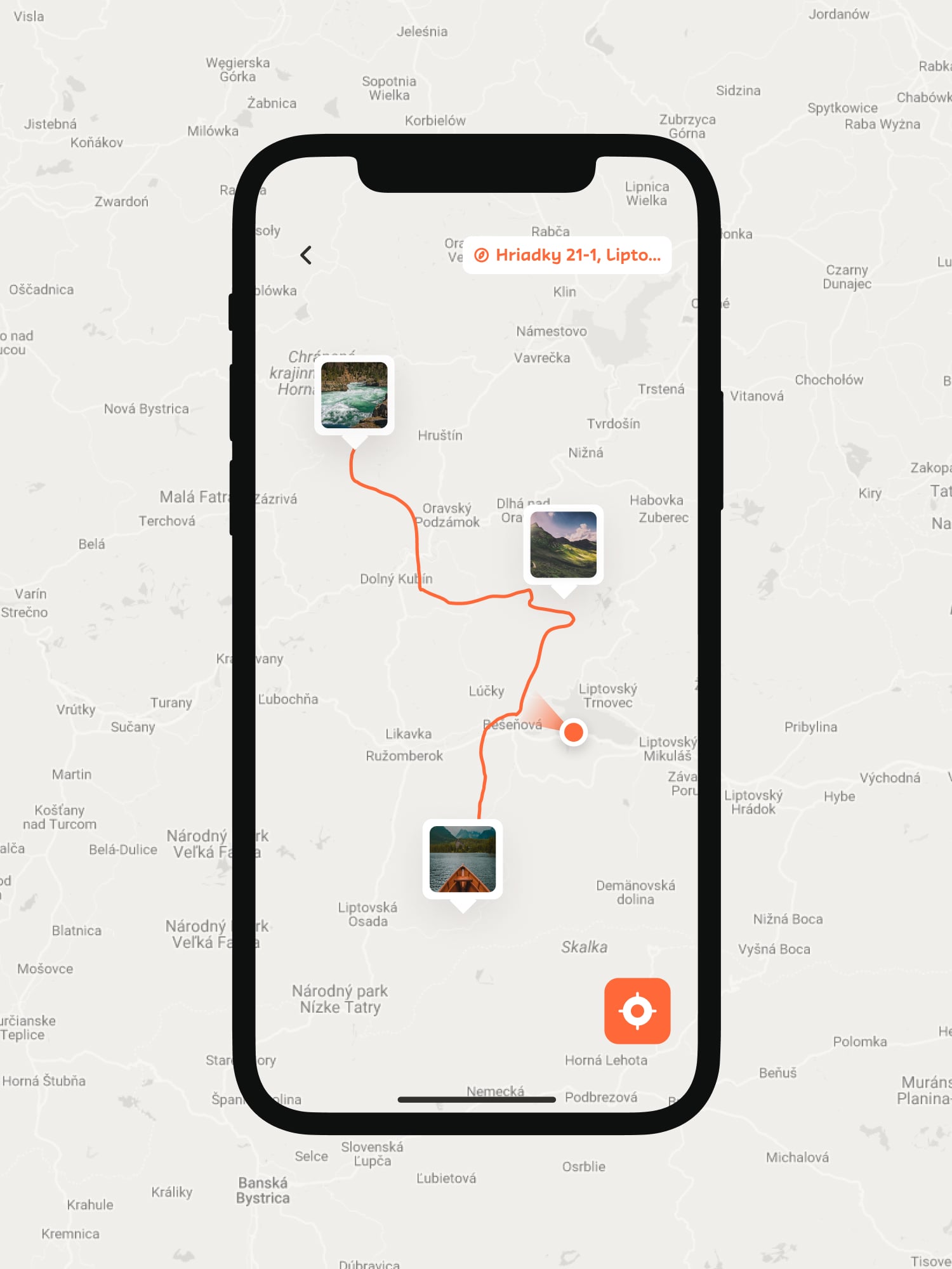
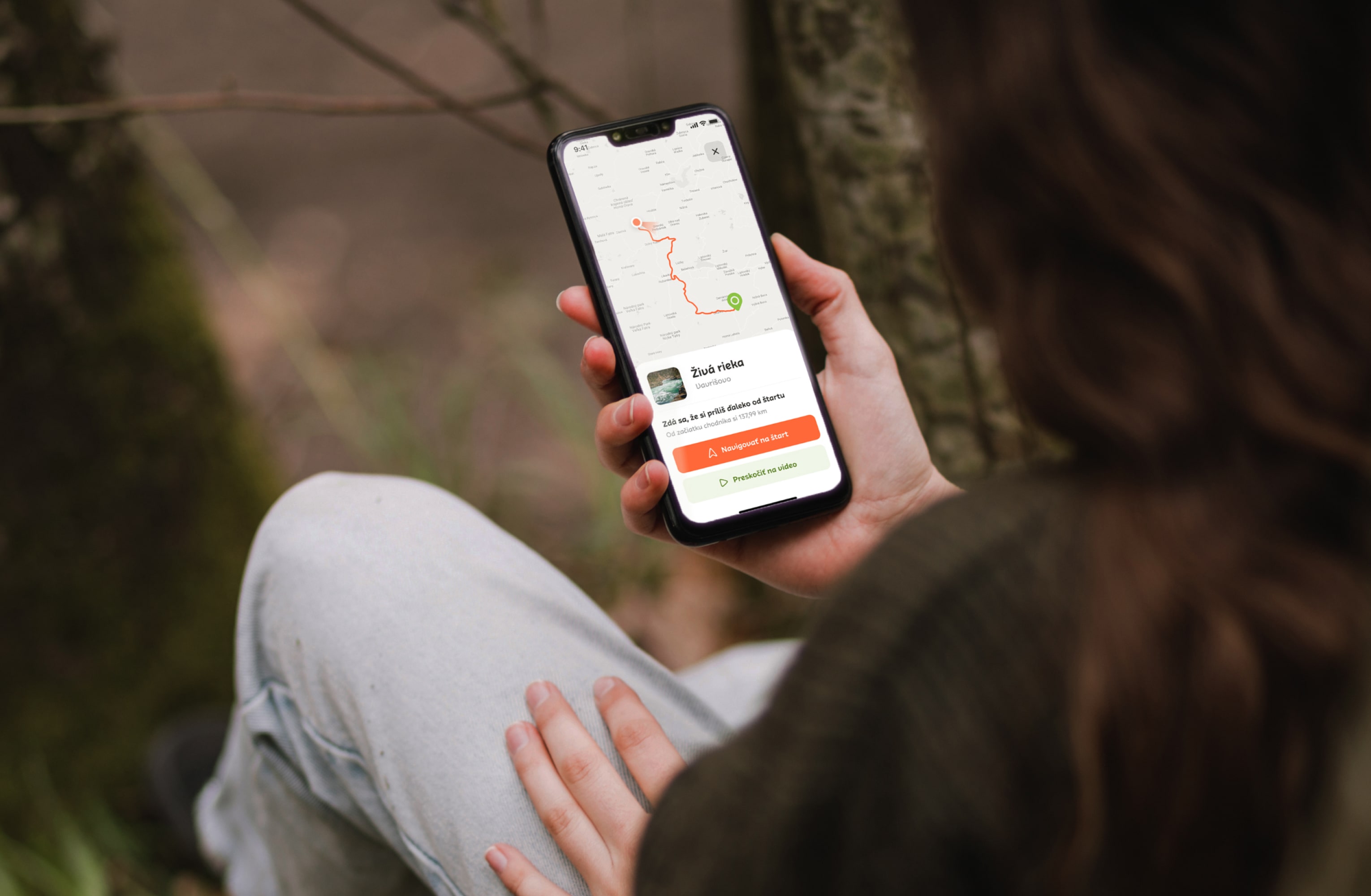
We were asked to modernize the design without deviating from the existing typography, brand colors and illustrations that the client provided us with. We aimed to strike a balance between familiarity and freshness. We introduced a simple yet fresh and friendly design language.
We were asked to modernize the design without deviating from the existing typography, brand colors and illustrations that the client provided us with. We aimed to strike a balance between familiarity and freshness. We introduced a simple yet fresh and friendly design language.
We were asked to modernize the design without deviating from the existing typography, brand colors and illustrations that the client provided us with. We aimed to strike a balance between familiarity and freshness. We introduced a simple yet fresh and friendly design language.
We were asked to modernize the design without deviating from the existing typography, brand colors and illustrations that the client provided us with. We aimed to strike a balance between familiarity and freshness. We introduced a simple yet fresh and friendly design language.
We were asked to modernize the design without deviating from the existing typography, brand colors and illustrations that the client provided us with. We aimed to strike a balance between familiarity and freshness. We introduced a simple yet fresh and friendly design language.
We were asked to modernize the design without deviating from the existing typography, brand colors and illustrations that the client provided us with. We aimed to strike a balance between familiarity and freshness. We introduced a simple yet fresh and friendly design language.
We were asked to modernize the design without deviating from the existing typography, brand colors and illustrations that the client provided us with. We aimed to strike a balance between familiarity and freshness. We introduced a simple yet fresh and friendly design language.
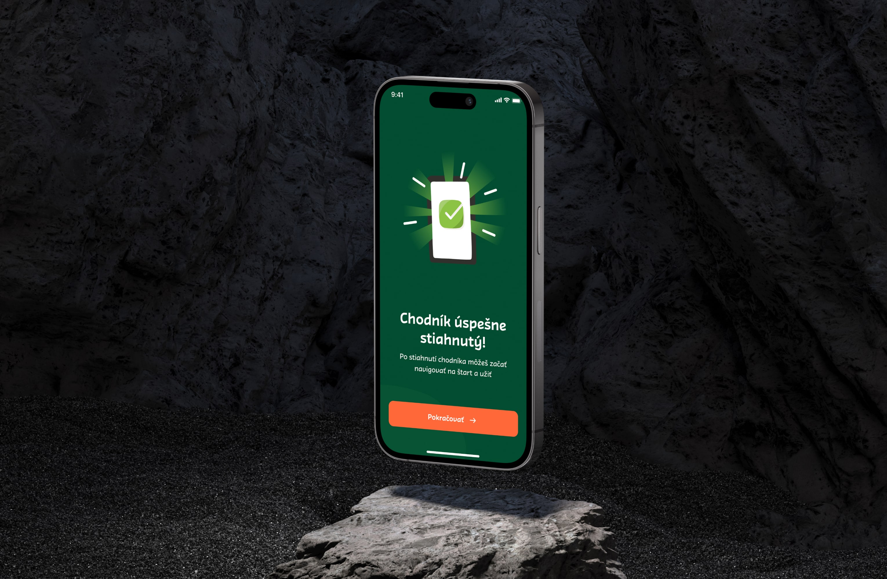


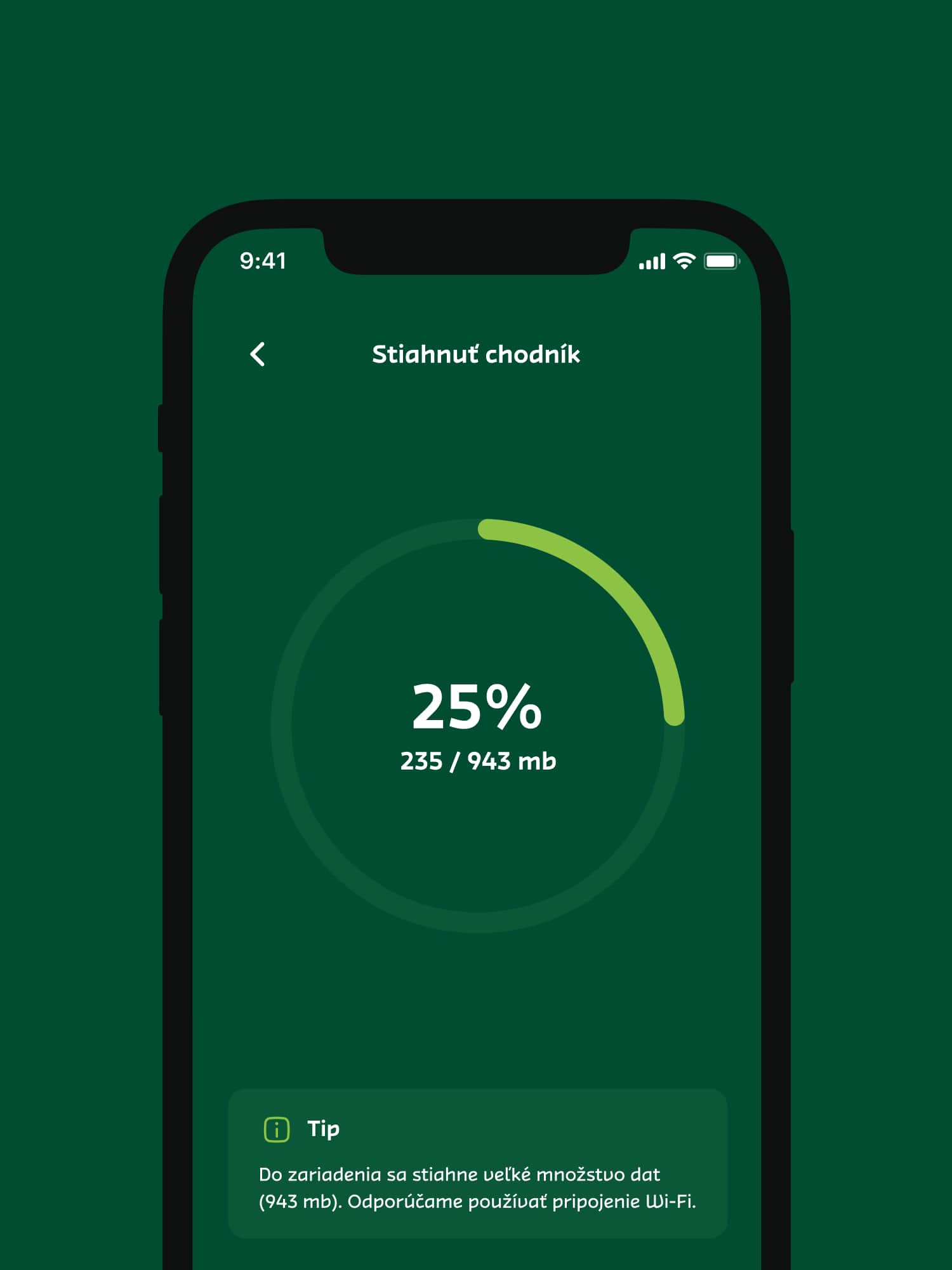


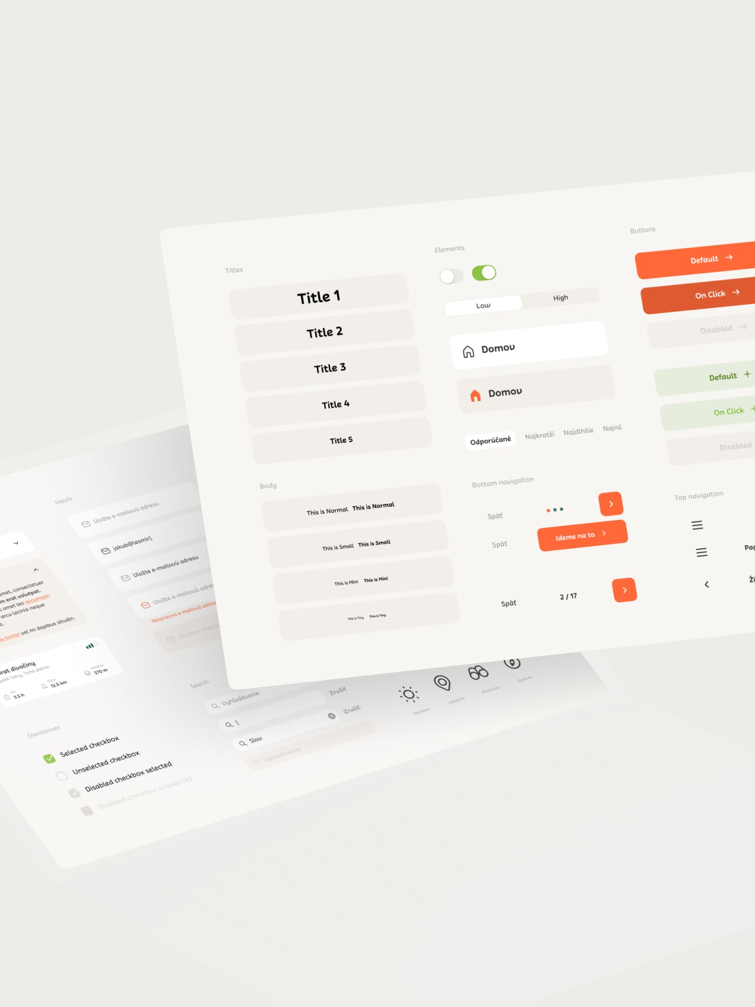


The UI was designed to be eye-catching and to reflect the architecture of the IMA’s parkour gyms and its solid parkour constructions. Together with the scratchy visual elements and bold and handwriting typography and it creates a truly personalised experience. The design also uses friendly cues for clear communication, ensuring users can find what they need quickly and effortlessly.
The UI was designed to be eye-catching and to reflect the architecture of the IMA’s parkour gyms and its solid parkour constructions. Together with the scratchy visual elements and bold and handwriting typography and it creates a truly personalised experience. The design also uses friendly cues for clear communication, ensuring users can find what they need quickly and effortlessly.
The UI was designed to be eye-catching and to reflect the architecture of the IMA’s parkour gyms and its solid parkour constructions. Together with the scratchy visual elements and bold and handwriting typography and it creates a truly personalised experience. The design also uses friendly cues for clear communication, ensuring users can find what they need quickly and effortlessly.
The UI was designed to be eye-catching and to reflect the architecture of the IMA’s parkour gyms and its solid parkour constructions. Together with the scratchy visual elements and bold and handwriting typography and it creates a truly personalised experience. The design also uses friendly cues for clear communication, ensuring users can find what they need quickly and effortlessly.
The UI was designed to be eye-catching and to reflect the architecture of the IMA’s parkour gyms and its solid parkour constructions. Together with the scratchy visual elements and bold and handwriting typography and it creates a truly personalised experience. The design also uses friendly cues for clear communication, ensuring users can find what they need quickly and effortlessly.
The UI was designed to be eye-catching and to reflect the architecture of the IMA’s parkour gyms and its solid parkour constructions. Together with the scratchy visual elements and bold and handwriting typography and it creates a truly personalised experience. The design also uses friendly cues for clear communication, ensuring users can find what they need quickly and effortlessly.
The UI was designed to be eye-catching and to reflect the architecture of the IMA’s parkour gyms and its solid parkour constructions. Together with the scratchy visual elements and bold and handwriting typography and it creates a truly personalised experience. The design also uses friendly cues for clear communication, ensuring users can find what they need quickly and effortlessly.
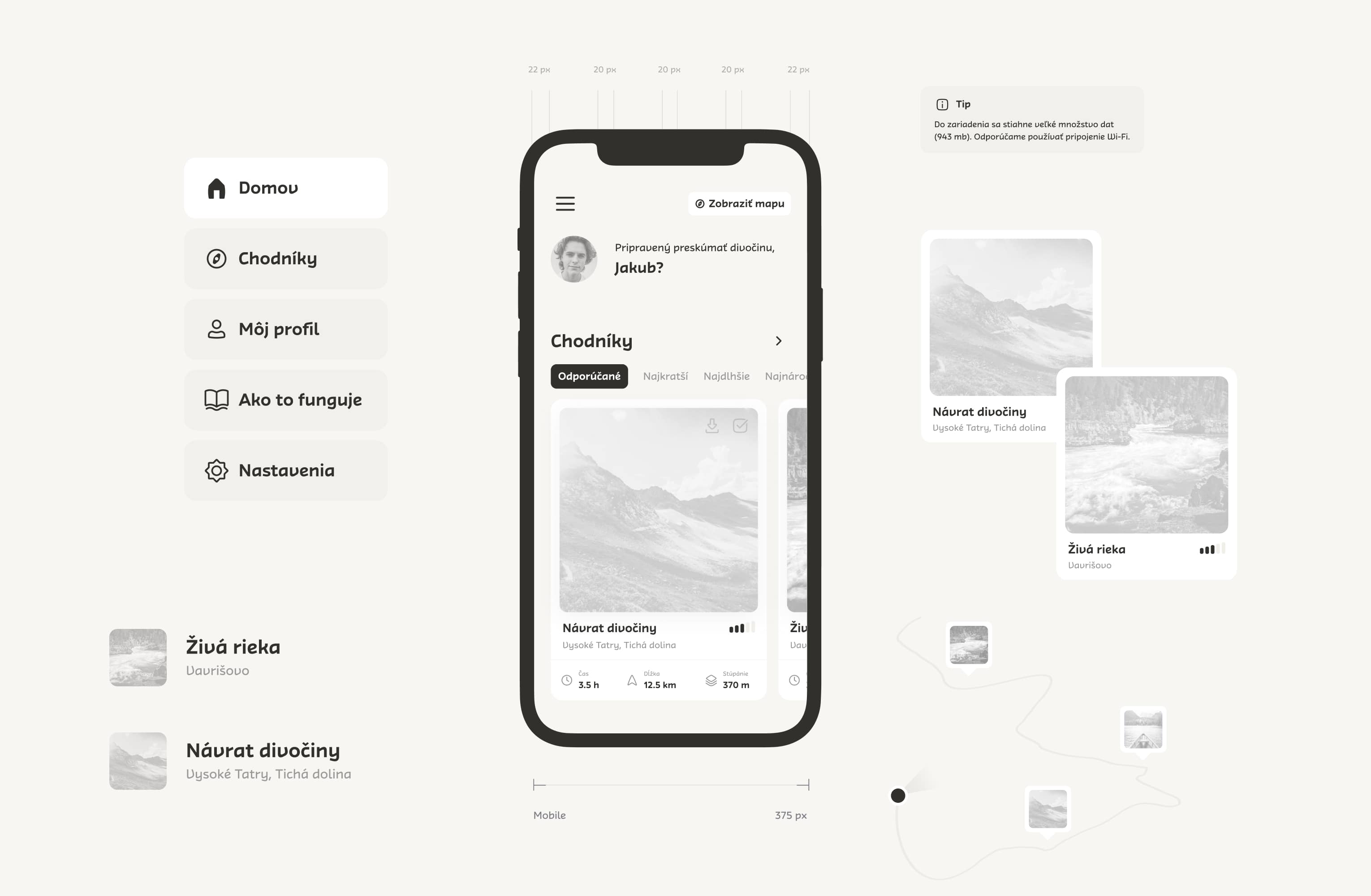


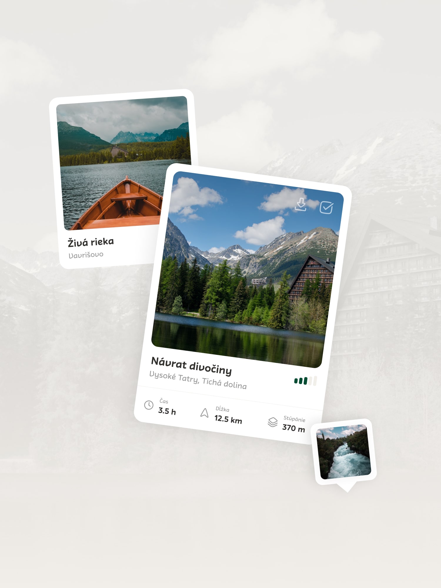
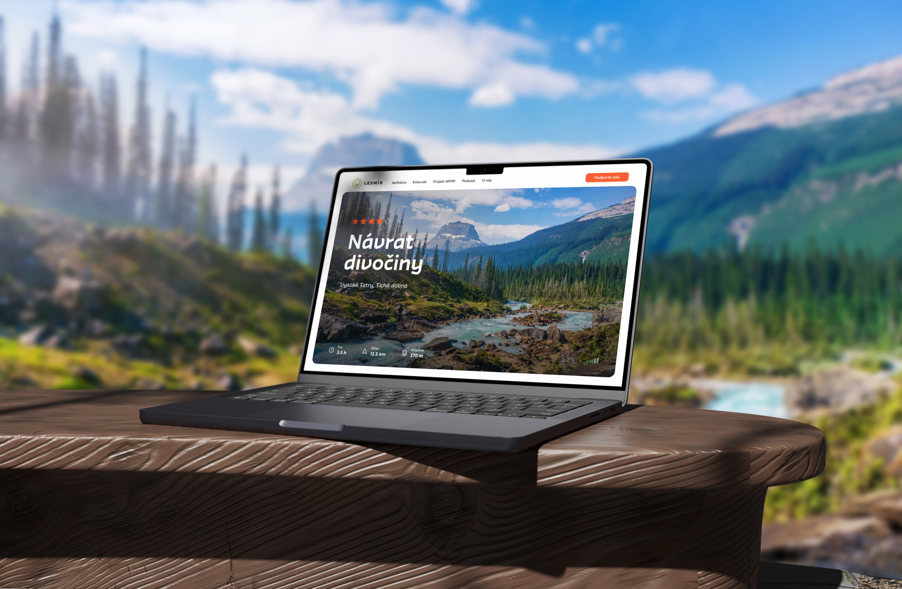
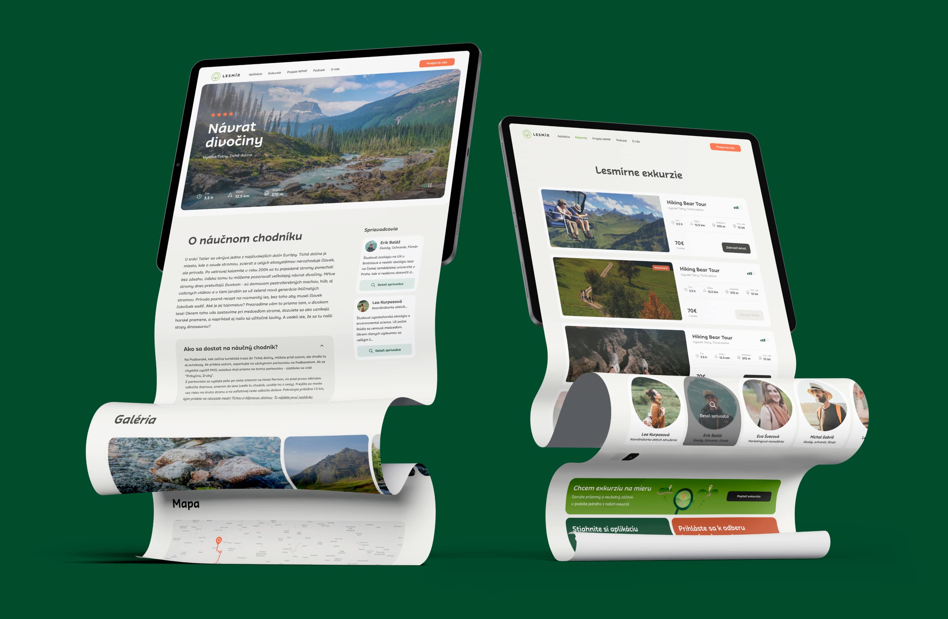
The website introduces users to the app and offers detailed insights into Lesmír's mission, the passionate individuals that stand behind the project, and the diverse excursions and digital guidance features that set Lesmír apart. Our challenge was to curate and present this wealth of information in a cohesive and visually engaging manner. We implemented sections for excursions, utilising high-quality media and captivating visuals to showcase the beauty of Slovak nature and the experience that Lesmír offers to its users.
The website introduces users to the app and offers detailed insights into Lesmír's mission, the passionate individuals that stand behind the project, and the diverse excursions and digital guidance features that set Lesmír apart. Our challenge was to curate and present this wealth of information in a cohesive and visually engaging manner. We implemented sections for excursions, utilising high-quality media and captivating visuals to showcase the beauty of Slovak nature and the experience that Lesmír offers to its users.
The website introduces users to the app and offers detailed insights into Lesmír's mission, the passionate individuals that stand behind the project, and the diverse excursions and digital guidance features that set Lesmír apart. Our challenge was to curate and present this wealth of information in a cohesive and visually engaging manner. We implemented sections for excursions, utilising high-quality media and captivating visuals to showcase the beauty of Slovak nature and the experience that Lesmír offers to its users.
The website introduces users to the app and offers detailed insights into Lesmír's mission, the passionate individuals that stand behind the project, and the diverse excursions and digital guidance features that set Lesmír apart. Our challenge was to curate and present this wealth of information in a cohesive and visually engaging manner. We implemented sections for excursions, utilising high-quality media and captivating visuals to showcase the beauty of Slovak nature and the experience that Lesmír offers to its users.
The website introduces users to the app and offers detailed insights into Lesmír's mission, the passionate individuals that stand behind the project, and the diverse excursions and digital guidance features that set Lesmír apart. Our challenge was to curate and present this wealth of information in a cohesive and visually engaging manner. We implemented sections for excursions, utilising high-quality media and captivating visuals to showcase the beauty of Slovak nature and the experience that Lesmír offers to its users.
The website introduces users to the app and offers detailed insights into Lesmír's mission, the passionate individuals that stand behind the project, and the diverse excursions and digital guidance features that set Lesmír apart. Our challenge was to curate and present this wealth of information in a cohesive and visually engaging manner. We implemented sections for excursions, utilising high-quality media and captivating visuals to showcase the beauty of Slovak nature and the experience that Lesmír offers to its users.
The website introduces users to the app and offers detailed insights into Lesmír's mission, the passionate individuals that stand behind the project, and the diverse excursions and digital guidance features that set Lesmír apart. Our challenge was to curate and present this wealth of information in a cohesive and visually engaging manner. We implemented sections for excursions, utilising high-quality media and captivating visuals to showcase the beauty of Slovak nature and the experience that Lesmír offers to its users.


THE result
THE result
THE result
THE result
THE result
THE result
Unified brand experience & user confidence
Unified brand experience & user confidence
Unified brand experience & user confidence
Unified brand experience & user confidence
Unified brand experience & user confidence
Unified brand experience & user confidence
Unified brand experience & user confidence
Unified brand experience & user confidence
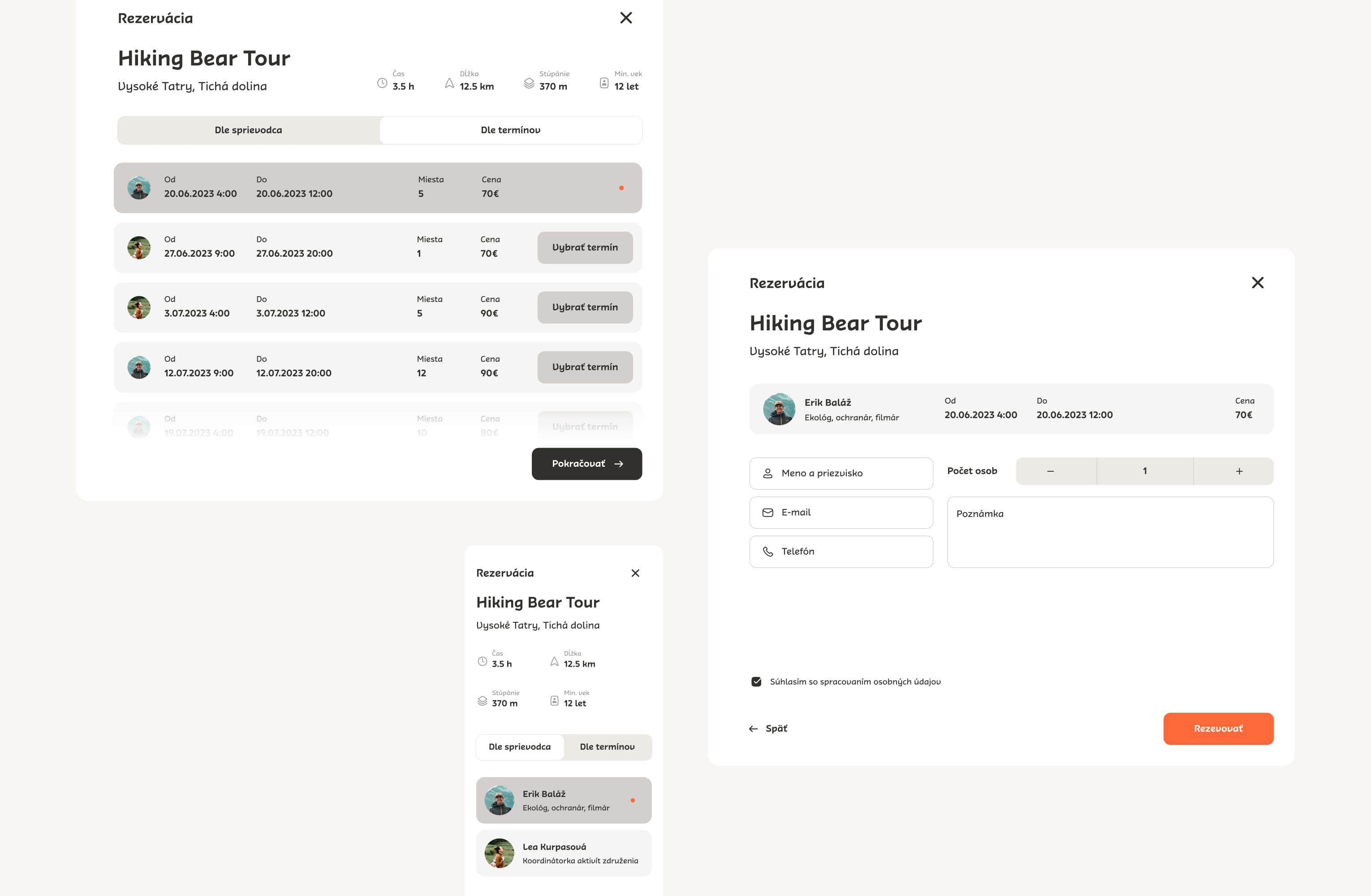
The redesign has helped Lesmír's users in many ways. Thanks to the seamless and intuitive UX, they are now more secure and confident when using the app, having a newfound sense of excitement in their adventures. The unified brand experience creates a sense of cohesion, aligning Lesmír's mission and values.
The redesign has helped Lesmír's users in many ways. Thanks to the seamless and intuitive UX, they are now more secure and confident when using the app, having a newfound sense of excitement in their adventures. The unified brand experience creates a sense of cohesion, aligning Lesmír's mission and values.
The redesign has helped Lesmír's users in many ways. Thanks to the seamless and intuitive UX, they are now more secure and confident when using the app, having a newfound sense of excitement in their adventures. The unified brand experience creates a sense of cohesion, aligning Lesmír's mission and values.
The redesign has helped Lesmír's users in many ways. Thanks to the seamless and intuitive UX, they are now more secure and confident when using the app, having a newfound sense of excitement in their adventures. The unified brand experience creates a sense of cohesion, aligning Lesmír's mission and values.


